Visualizing High-Dimensional Data Using Parallel Coordinates
The human brain has a remarkable ability to recognize patterns in graphical representations of data, which is why visual methods continue to play a crucial role in data-mining tasks. When data is visualized effectively, humans can detect both relevant and irrelevant structures and draw meaningful conclusions. However, designing appropriate visualization tools—especially for high-dimensional data—remains a significant challenge. This is due to our spatial perception being limited to three dimensions, which means high-dimensional data must be mapped to lower dimensions.
Parallel Coordinates (commonly ||-Coordinates), introduced by Alfred Inselberg (Inselberg, 1985), follow such an approach by mapping high-dimensional data to 2D using a systematic and interpretable method.
In this blog post, we will briefly introduce ||-Coordinates, explore their properties, and apply them to various datasets. We will also compare the results to several other visualization techniques.
R scripts and additional resources used in this blog post are available on GitHub at
https://github.com/MarkusThill/MultiDiminsionalViz.
Introduction
In many application areas today, large and high-dimensional datasets with unknown content are frequently generated. To gain insights and uncover essential information hidden within such data, these datasets must be explored systematically and carefully. Often, it is unclear at the outset how to approach unfamiliar and complex data or which tools are best suited for the task. Typically, raw data is presented in textual or tabular form, which can be difficult for most people to interpret and makes it nearly impossible to detect hidden structures.
To develop an initial understanding of the data, visual representations can support users in identifying meaningful patterns. However, human perception is limited to a maximum of three spatial dimensions. As a result, data with more than three dimensions must be mapped to lower-dimensional spaces—typically two dimensions—for effective graphical presentation. The challenge lies in preserving as much of the relevant structure as possible during this dimensionality reduction. Choosing a suitable visualization method is therefore a non-trivial task. Users are often faced with a wide range of options, each offering a different perspective on the data and each with its own advantages and disadvantages.
Visualization techniques include geometric methods like the well-known scatter plots, pixel-oriented techniques such as dimensional stacking (LeBlanc et al., 1990), and icon-based methods like Chernoff-faces (Chernoff, 1973).
In this blog post, we present a geometric-based visualization technique called Parallel Coordinates (hereafter referred to as ||-Coordinates), which was specifically designed to visualize multidimensional and multivariate data (Inselberg, 1985). ||-Coordinates for two dimensions were first described in 1885 by Maurice d’Ocagne, and later rediscovered independently in 1959 by Alfred Inselberg, who was unaware of d’Ocagne’s earlier work ((Inselberg, 2012), p. 16).
The core idea of ||-Coordinates is to project high-dimensional datasets into two dimensions \((\mathbb{R}^N \rightarrow \mathbb{R}^2)\) by placing each dimension’s axis in parallel and representing individual samples as polygonal lines. This 2D representation is well suited for visual exploration and pattern recognition, making it easier to identify relationships within the data (Inselberg, 1997).
In practice, ||-Coordinates have been successfully used in a variety of fields—for instance, in automatic collision detection and avoidance systems in air traffic control (covered by three U.S. patents), as well as in data mining and optimization tasks (Plemenos & Miaoulis, 2009).
We will make extensive use of ||-Coordinates throughout this blog post, applying the technique to diverse datasets and exploring its specific characteristics.
Fundamentals of Parallel Coordinates
Construction and Properties
Consider an \(N\)-dimensional dataset containing \(k\) observations. The construction of a ||-Coordinates graph for visualizing this data proceeds as follows:
Analogous to the Cartesian coordinate system, one individual axis is required for each dimension. Thus, a total of \(N\) axes is created. These axes are arranged in parallel to each other on the plane—typically equally spaced and oriented vertically.
More precisely, a ||-Coordinates graph can be interpreted as a collection of parallel \(Y\)-axes embedded within an \(XY\)-Cartesian coordinate system. For the \(i\)-th dimension (out of \(N\) total), the corresponding Y-axis is duplicated and positioned at \(d_i\)—the distance from the origin—along the \(X\)-axis. Typically, the axes are spaced uniformly: \(d_1 = d_2 = \ldots = d\). Each axis in ||-Coordinates is labeled \(\overline{X}_i\).
There are \(N - 1\) segments (i.e., regions between adjacent axes). Given \(N\) axes, there are \(\frac{N(N - 1)}{2}\) possible pairs of axes and \(N!\) permutations for the arrangement of all \(N\) axes.
A point \(P = (x_1, x_2, \cdots, x_N)\) in \(\mathbb{R}^N\) can be mapped to a polygonal line in ||-Coordinates by connecting the values \(x_i\) on their respective axes \(\overline{X}_i\) using straight lines. A set of \(k\) points will therefore produce \(k\) polygonal lines in the ||-Coordinates graph (Inselberg, 1985; Heinrich & Weiskopf, 2013; Inselberg & Dimsdale, 1990).
Inselberg notes that the representational complexity of ||-Coordinates is \(O(N)\), as each additional dimension merely adds one more axis (Inselberg, 1997). While this is true in a structural sense, the ordering of axes plays a crucial role in visual interpretation. Consequently, in many cases, multiple ||-Coordinates plots with different axis orderings must be generated and compared—effectively increasing the cognitive and computational complexity.
There are no inherent restrictions on the dimensionality of the data for Parallel Coordinates. In theory, ||-Coordinates can represent data with an infinite number of dimensions. In practice, however, the usable number of dimensions depends on factors such as dataset size, screen resolution, and human perceptual limits. We did not find a clearly defined upper bound in the literature.
Examples
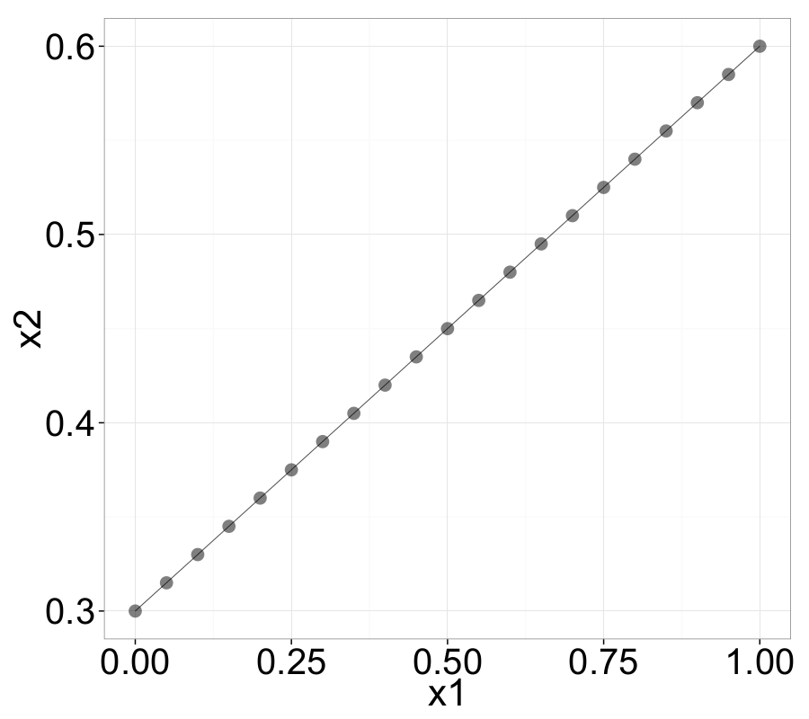
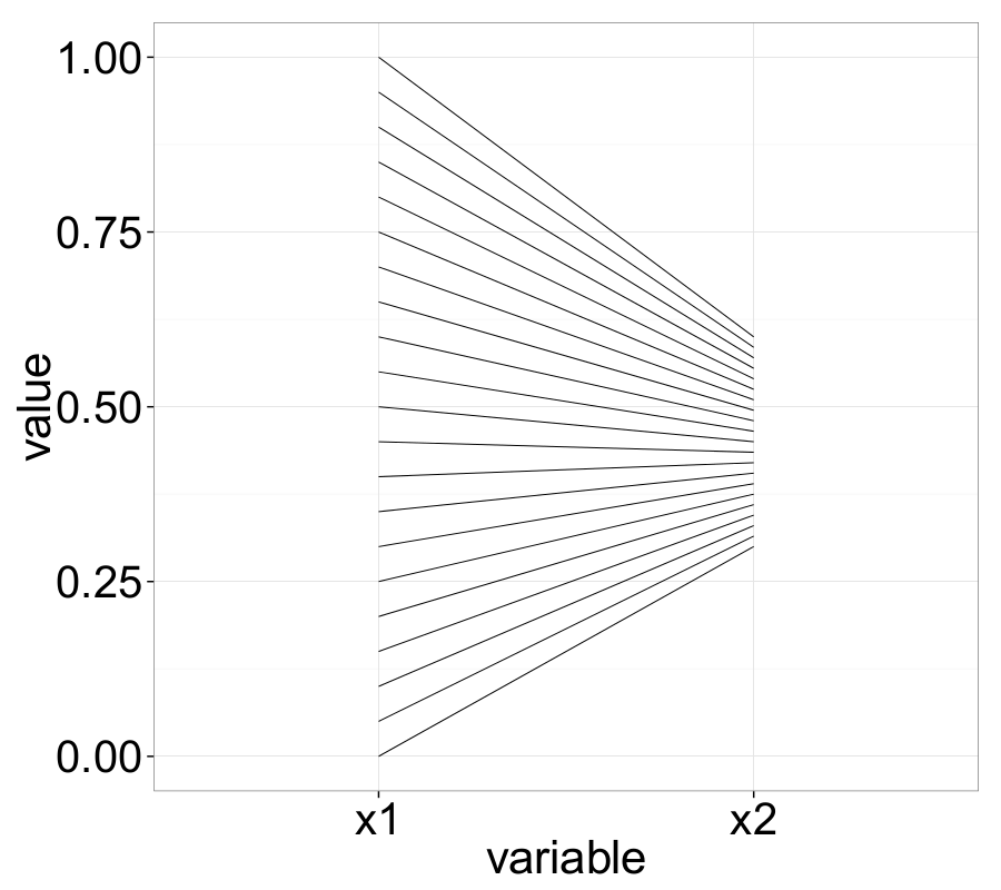
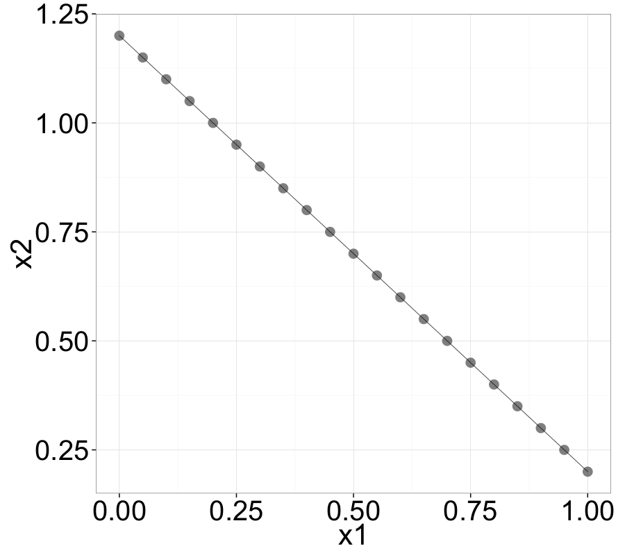
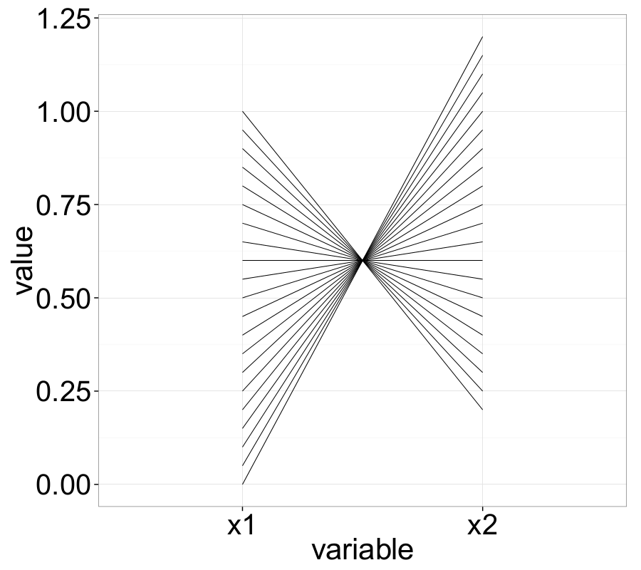
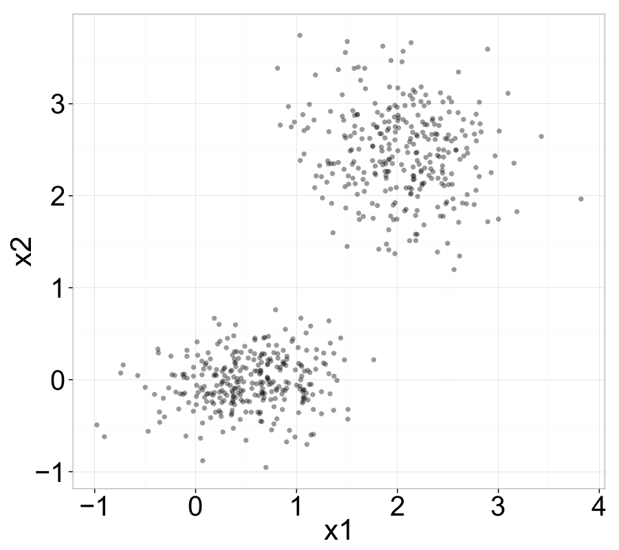
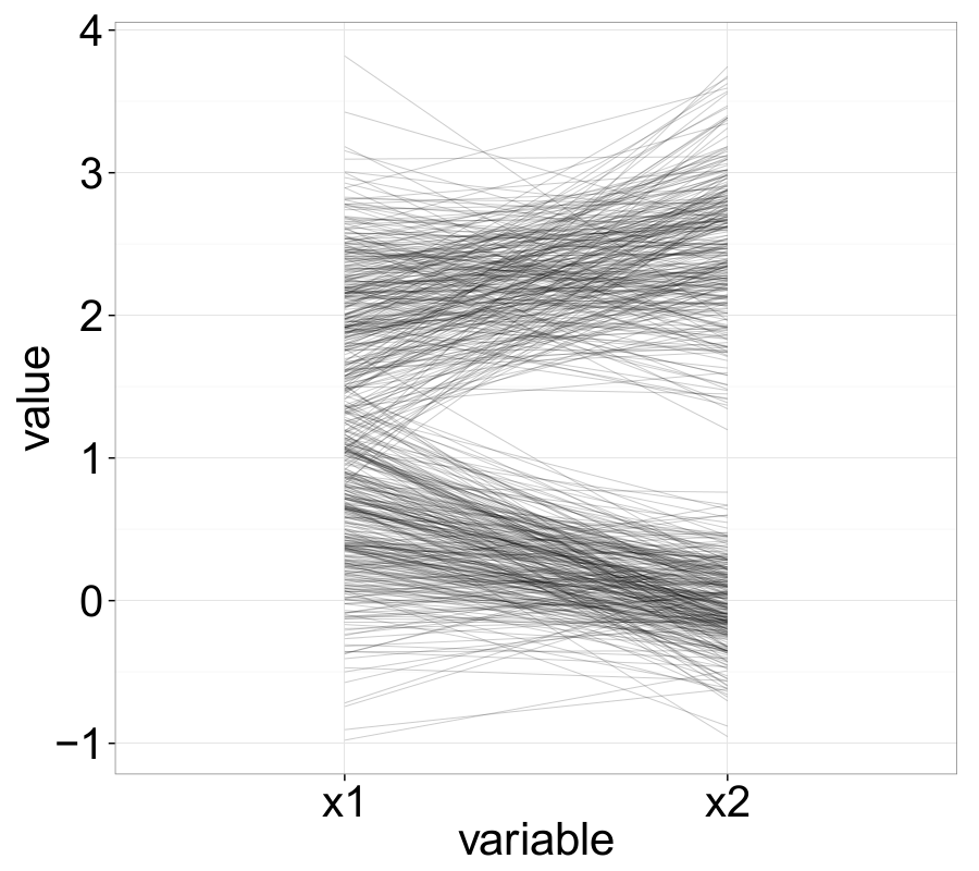
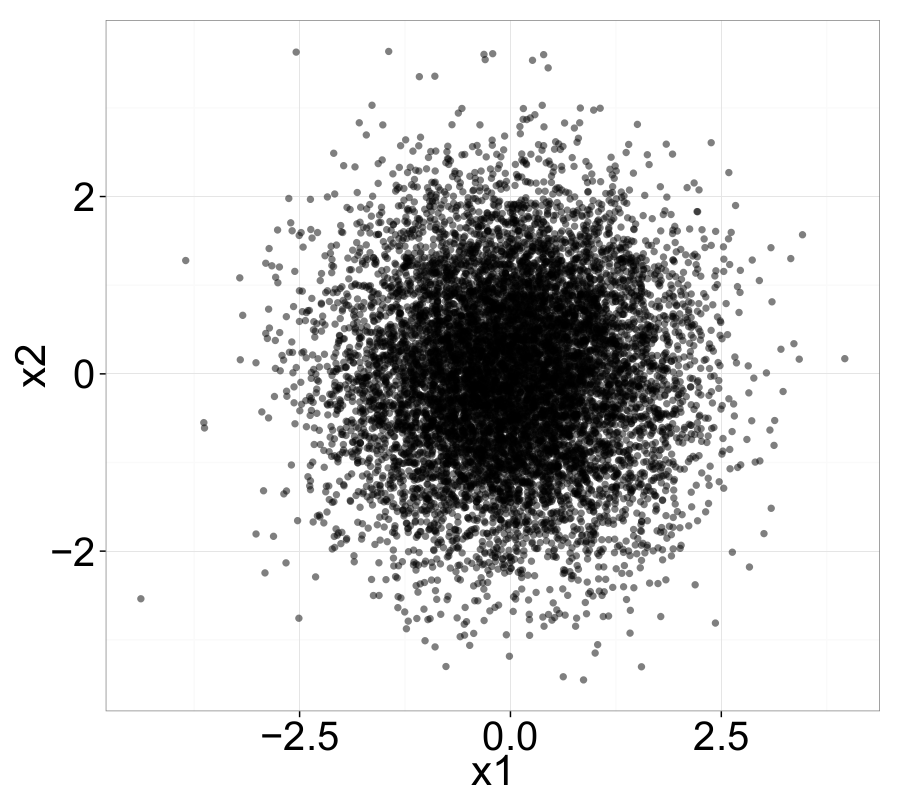
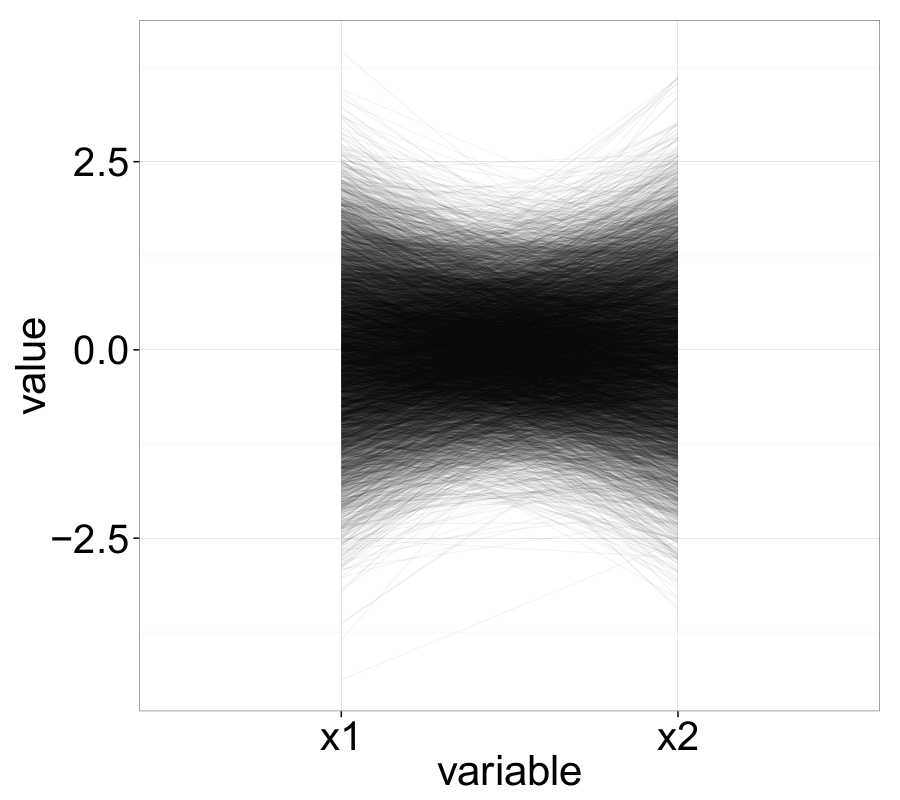
The following examples nicely illustrate several important properties of ||-Coordinates. For instance, negatively correlated variables—represented in Cartesian space by a straight line with negative slope—appear as intersecting lines in the ||-Coordinates graph.
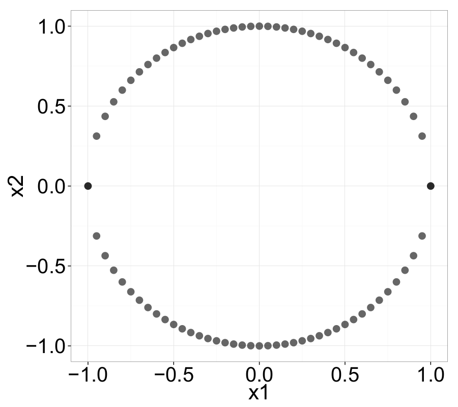
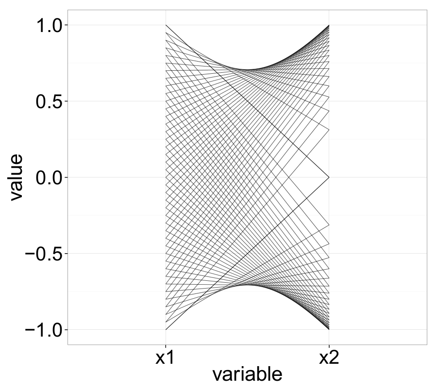
Point-Line Duality
Extensive theoretical work on ||-Coordinates has been conducted by Inselberg (Inselberg, 1985; Inselberg & Dimsdale, 1990), including the concept of point-line duality. At this point, we offer a brief overview: Point-line duality describes the fundamental relationship between points and lines — specifically, that points in the Cartesian coordinate system can be mapped to lines in the parallel-coordinates domain, and vice versa.
As mentioned earlier, a set of points in the Cartesian coordinate system is transformed into a set of polygonal lines in ||-Coordinates. For instance, a point \(P = (p_1, p_2)\) in 2D Cartesian space is mapped to a line that connects the point \(y = p_1\) on the \(\overline{X}_1\)-axis with the point \(y = p_2\) on the \(\overline{X}_2\)-axis. Assuming that \(\overline{X}_2\) is placed at \(d_2 = (0, d)\), the resulting line can be described by:
\[\begin{equation} y = \frac{p_2 - p_1}{d} x + p_1 , \quad d > 0. \label{ch3:eq:pointToLine} \end{equation}\]It can be shown that a set of points lying on a linear function in Cartesian space (e.g., \(P_\text{we} = (p_1, m \cdot p_1 + b)\)) will result in a family of lines in ||-Coordinates that all intersect at a common point \(\overline{P_s}\):
\[\begin{equation} \overline{P_s} = \left( \frac{d}{1 - m}, \frac{b}{1 - m} \right), \quad m \neq 1. \label{ch3:eq:pointToLineIntersec} \end{equation}\]This intersection point corresponds to exactly one line in the \(XY\)-domain, thereby completing the point-line duality theorem. As seen in equation \eqref{ch3:eq:pointToLineIntersec}, if the slope of the sampled linear curve \(\ell\) is \(m < 0\), then the lines \(\overline{\ell_i}\) in the ||-Coordinates system will intersect between the axes \(\overline{X}_1\) and \(\overline{X}_2\). For \(m > 1\), the virtual extensions of all \(\overline{\ell_i}\) intersect to the right of \(\overline{X}_2\), and analogously, for \(0 < m < 1\), to the left of \(\overline{X}_1\). In the special case where \(m = 1\), the resulting set of lines \(\overline{\ell_i}\) will not intersect within the ||-Coordinates plot.
Inselberg provides a more detailed treatment of the underlying theory in (Inselberg, 2012) (Chapter 3).
Tasks
In general, ||-Coordinates can be applied to a wide range of high-dimensional visualization problems across various application areas. Perhaps the most important purpose of ||-Coordinates is simply to provide a general overview of the visualized data. At a glance, ||-Coordinates can reveal a wealth of information: outliers and other anomalies or patterns can be identified quickly. This initial summary can help guide the user’s data-mining process and suggest directions for further exploration.
Cluster analysis — the task of finding sets of samples with similar structure — can also be supported by ||-Coordinates. Obvious clusters can often be identified by inspecting individual axes, while clusters in higher dimensions may emerge from line characteristics such as density, proximity, slope, and intersection patterns.
Frequently, visual clustering in ||-Coordinates is combined with the search for correlations within the data. ||-Coordinates can reveal many types of correlation; for instance, a strong negative linear correlation typically results in a set of lines intersecting at a single point between two adjacent axes.
Moreover, ||-Coordinates can aid in classification tasks, and to some extent in regression tasks as well (Heinrich & Weiskopf, 2013). One common approach is to color samples from different classes to visually compare their characteristics. This can help identify which attributes best separate the classes — a task not limited to classification, but relevant for general feature selection too. ||-Coordinates can also assist in evaluating or developing classifiers, especially when used interactively in combination with algorithmic classifiers, as proposed in (Xu et al., 2007; Steed et al., 2012).
Finally, ||-Coordinates may be used for verification purposes — potentially in combination with the tasks above — or simply as a reporting tool, even without a specific intention of knowledge discovery.
Common Issues
Although ||-Coordinates are often a powerful tool for visualizing high-dimensional data, several common issues should be considered. One major challenge is overplotting (often referred to as visual clutter). When visualizing large datasets, the multitude of overlapping lines can obscure important patterns in the plot (Heinrich & Weiskopf, 2013).
Various techniques have been proposed to mitigate visual clutter in ||-Coordinates. One straightforward approach is to (randomly) sample the dataset, which can preserve the most prominent patterns while reducing clutter. However, this method inevitably entails information loss and may lead to data misinterpretation. A number of sampling strategies are discussed in (Ellis & Dix, 2007).
Other clutter-reduction techniques include:
- Brushing, which allows users to interactively highlight selected observations while dimming or hiding others.
- Density-based methods, such as alpha blending, where overlapping lines are rendered with transparency so dense areas appear darker.
- Aggregation, e.g., by clustering, to reduce the number of individual lines displayed.
- Axis-reconfiguration, which includes reordering or inverting axes to expose structure more clearly.
A comprehensive overview of clutter-reduction methods is available in (Heinrich & Weiskopf, 2013).
Another critical issue is axis ordering. The arrangement of axes in ||-Coordinates has a significant impact on which patterns can be visually perceived. Typically, relationships can only be observed between adjacent axes, so the choice of axis sequence can either reveal or obscure meaningful patterns. For small numbers of dimensions, it may be feasible to try all \(N!\) permutations of the axis order (for \(N\) variables), but this quickly becomes impractical as dimensionality grows. Fortunately, analyzing only pairwise relationships reduces the complexity substantially.
The Parallel Coordinates Matrix (PCM) (Heinrich et al., 2012) is one solution that visualizes all pairwise relationships using a compact set of ||-Coordinates plots. Another approach is to use automated axis-ordering algorithms that rank different axis configurations according to correlation or pattern strength, and present the most promising ones to the user (Tatu et al., 2009).
A further challenge arises when multiple lines intersect at the exact same point on an axis — a situation that commonly occurs when axes represent discrete variables. In such cases, it becomes ambiguous how to trace individual lines, as multiple continuations are possible. While using distinct colors can help, this approach is only practical for small datasets. More advanced solutions include using curves instead of straight lines, or interactive techniques to isolate and highlight specific samples (Heinrich & Weiskopf, 2013).
Related Work, Variations, and Extensions of Parallel Coordinates
Since the introduction of ||-Coordinates by Inselberg, extensive research has expanded and adapted the technique to address specific challenges, enhance usability, and support diverse application areas such as clustering, classification, and exploratory data analysis.
One key direction of this research involves hybrid visualization techniques, which combine parallel coordinates with other methods to leverage their respective strengths and compensate for weaknesses. For instance, in (Yuan et al., 2009), scatter plots and multidimensional scaling are integrated into the parallel coordinates framework. Similarly, Fanea et al. enhance clutter reduction by combining ||-Coordinates with star glyphs. In (Bertini et al., 2005), RadViz is coupled with ||-Coordinates: RadViz is used for brushing, clustering, and coloring, while parallel coordinates visualize the quantitative dimensions of the data.
Several efforts extend the original concept to support three-dimensional visualizations. Rübel et al. (Rübel et al., 2009) replace traditional axes with scatter plot planes and connect corresponding data points across planes using polygonal lines. In (Streit et al., 2006), isosurfaces are generated based on data density, providing a volumetric representation that emphasizes high-density regions. Dang et al. (Nhon et al., 2010) follow a similar strategy by stacking overlapping graphical elements to alleviate overplotting.
While classic ||-Coordinates focus on discrete samples, extensions have also been proposed for continuous data. For example, (Heinrich & Weiskopf, 2009) introduce a density-based model to represent continuous domains in parallel coordinates.
As discussed earlier, the Parallel Coordinates Matrix (PCM) (Heinrich et al., 2012) is an important innovation designed to address the axis-ordering challenge. It enables visualization of all pairwise axis relationships using a compact number of parallel coordinate plots. This method builds on graph theory, where each axis is represented as a vertex in a complete graph. Using Hamiltonian decomposition, a set of Hamiltonian paths (for even \(N\)) or Hamiltonian cycles (for odd \(N\)) is computed. A Hamiltonian path visits each vertex exactly once; Hamiltonian cycles extend these paths to form loops. In the axis-ordering context, for odd \(N\), one dimension is added to both ends of each Hamiltonian path to complete the cycle. This technique reduces the number of required plots to visualize all axis-pairs to \(\lfloor \frac{N}{2} \rfloor\).
We have implemented the PCM approach in R (R Core Team, 2016), enabling users to compute Hamiltonian paths and cycles and display the corresponding ||-Coordinates graphs in a compact, structured layout. This method will be used extensively in later parts of this analysis.
Applications and Experimental Setup
In this section, we introduce several datasets used to explore the capabilities and limitations of ||-Coordinates. The datasets vary in dimensionality, number of observations, and attribute types. Among them, the Out5d and Pollen datasets have the lowest dimensionality (five attributes each), while the MiniBooNe dataset is the most complex with 51 dimensions. These datasets will be employed for various analytical tasks including classification, clustering, outlier detection, and the identification of patterns and correlations.
To support the analysis, we developed custom scripts for generating ||-Coordinates plots and ||-Coordinates Matrix plots (based on the Hamiltonian decomposition technique described in (Heinrich et al., 2012)). These visualizations are implemented in R (R Core Team, 2016), utilizing the ggplot2 package. Although some ||-Coordinates functionality is available in R (e.g., via ggpcp), the default capabilities were insufficient for our requirements. Our implementation includes extended features such as:
- Brushing for highlighting subsets of interest (e.g., clusters),
- Color-coding of samples based on class or other attributes,
- Axis inversion to reduce clutter (especially helpful for negatively correlated dimensions),
- Data scaling for consistent comparison,
- Intensive use of the ||-Coordinates Matrix for exploring axis-ordering and pairwise relationships.
The Pollen Dataset
The Pollen dataset captures geometric features of pollen grains (Coleman, 1986). It was compiled by David Coleman at RCA Labs (Princeton, USA) in 1986 and served as the American Statistical Association (ASA) Exposition dataset for a data visualization competition. The dataset comprises 3,848 observations with five attributes:
- ridge: feature length in the \(x\)-direction,
- nub: feature length in the \(y\)-direction,
- crack: feature length in the \(z\)-direction,
- weight: the weight of the pollen grain,
- density: the density of the grain.
Given its modest dimensionality and visually interesting structure, the Pollen dataset is particularly well-suited for illustrating core concepts of ||-Coordinates. We will use it to demonstrate fundamental features and techniques before applying more complex analyses to higher-dimensional datasets.
The Out5D Dataset
The 5-dimensional Out5d dataset comprises 16,384 observations of remotely sensed data collected in a western region of Australia. The dataset was provided by Peter Ketelaar for Worcester Polytechnic Institute in 2005 (Ketelaar, 2005). Unfortunately, only limited background information is available, though the following details are known: The measurements were taken over a \(128 \times 128\) spatial grid, with each grid cell representing one observation. Each observation contains radiometric information across five attributes:
- spot
- magnetics
- potassium (radiometric band)
- thorium (radiometric band)
- uranium (radiometric band)
Despite the lack of metadata, the Out5d dataset has been used extensively in the literature for pattern detection, clustering, and visualization tasks. It is frequently cited as a benchmark dataset for evaluating high-dimensional visualization techniques. Publications such as (Malik & Ünlü, 2011; Bertini et al., 2005; Makwana et al., 2012; Zhou et al., 2009; Yu et al., 2012; G. Palmas et al., 2014; Johansson & Cooper, 2008; Artero et al., 2004; Bertini et al., 2006) apply various visualization and analysis strategies to this dataset.
We will leverage ||-Coordinates to explore structural patterns in the Out5d dataset and compare our findings with selected results from the above works.
The Wine Quality Dataset
The Wine Quality dataset contains a total of \(6497\) samples describing red (1599 samples) and white (4898 samples) Vinho Verde wines from the north-western region Minho of Portugal. The data was collected between May 2004 and February 2007 and is publicly available from the UCI Machine Learning Repository (Bache & Lichman, 2013).
Each sample is characterized by 12 attributes:
- Eleven attributes are based on objective physicochemical laboratory tests:
fixed acidity, volatile acidity, citric acidity, residual sugar, chlorides, free sulfur dioxide, total sulfur dioxide, density, pH, sulphates, and alcohol. - The twelfth attribute is quality, a subjective score (ranging from 0 to 10) assigned by three certified wine tasters. Further details can be found in (Cortez et al., 2009).
Our analysis follows the general approach by Cortez et al. (Cortez et al., 2009), seeking relationships between the objective physicochemical properties and the subjective quality ratings. Additionally, we will investigate differences between red and white wines. Identifying such relationships may support quality improvement through purposeful manipulation of controllable variables.
While Cortez et al. primarily applied machine learning methods such as Support Vector Machines, multiple regression, and neural networks, we will use ||-Coordinates as our main visual analysis tool to identify structural patterns, correlations, and outliers in the data.
Besides (Cortez et al., 2009), several other studies have used this dataset, typically in the context of regression or classification tasks (Appalasamy et al., 2012; Nachev & Stoyanov, 2012; Lambrou et al., 2012; Dasgupta & Kosara, 2010).
MiniBooNe Particle Identification Dataset
The MiniBooNe dataset (retrieved from (Bache & Lichman, 2013)) was generated for the MiniBooNe experiment at Fermilab in Batavia, Illinois. The goal of this experiment was to investigate neutrino oscillations (Roe et al., 2005). The dataset contains 130,065 observations, each described by 50 numeric attributes. Each sample corresponds to either an electron neutrino or a muon neutrino. For the remainder of this post, we refer to electron neutrinos as signal events and muon neutrinos as background events.
The MiniBooNe dataset is the largest used in this blog post — both in terms of the number of observations and dimensionality. In one of the subsequent sections, we will apply ||-Coordinates to this dataset and perform a basic visual classification task, attempting to distinguish signal from background events.
Unfortunately, detailed information about the meaning of individual attributes is not publicly available, and we are not aware of any prior publications that apply visualization techniques to this dataset. Therefore, for simplicity, we will label the attributes as V1 through V51, where V51 denotes the class label (i.e., signal or background).
Analysis
Introductory Example: The Pollen Dataset
To begin our analysis, we explore the Pollen dataset using ||-Coordinates.
As a first step, we generate a basic ||-Coordinates plot of all 3,848 observations without applying any adjustments or parameter tuning (see Fig. 3). Due to the large number of data points, the plot exhibits a high level of overplotting — a common issue in ||-Coordinates visualizations with dense datasets.
Despite this visual clutter, the plot already reveals some general characteristics and patterns in the data. For instance, we can see clusters of values and a few dominant trends across axes, offering a rough sense of correlation and spread between variables.
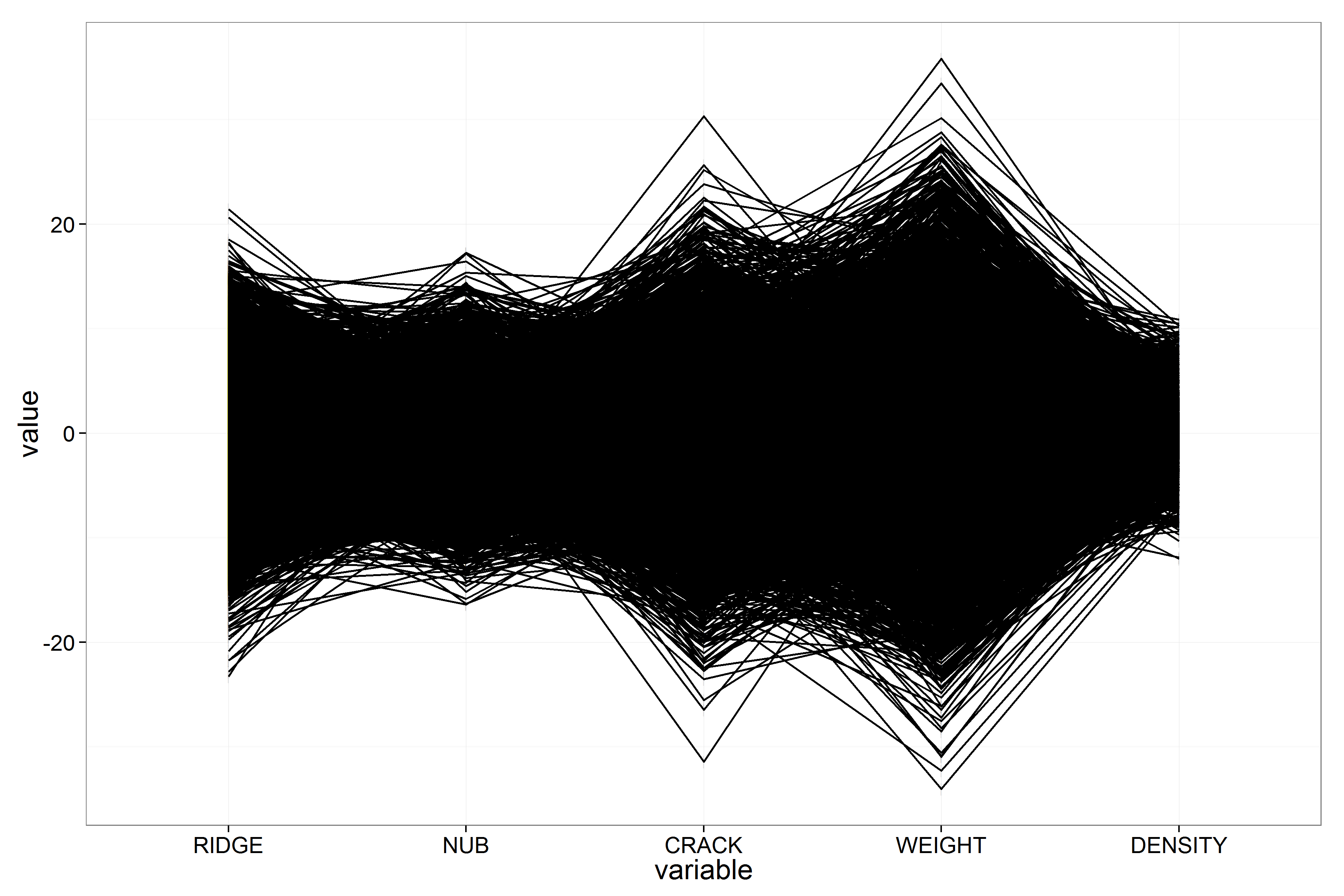
To address the issue of overplotting inherent in classical ||-Coordinates plots, we apply alpha blending — a density-based rendering technique that uses transparency to emphasize areas of high point concentration. For this visualization, we set the opacity to \(\alpha = 0.05\). The resulting plot is shown in Fig. 4.
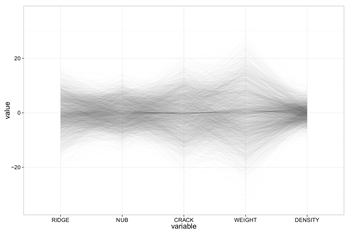
At first glance, the data appears to lack significant outliers. Observations across all five dimensions are centered around zero, and the plot shows characteristic hyperbolic envelopes—a visual hallmark of normally distributed data in ||-Coordinates plots.
To confirm this, we inspect the marginal distributions using a density plot (Fig. 5). Each attribute is indeed roughly normally distributed, albeit with varying standard deviations. However, the plot also reveals a consistent anomaly: an unexpected spike in density near the mean of each variable. This anomaly corresponds to the unusually dense central cluster visible in the previous ||-Coordinates plot and may hint at latent structure or subgroups within the dataset.
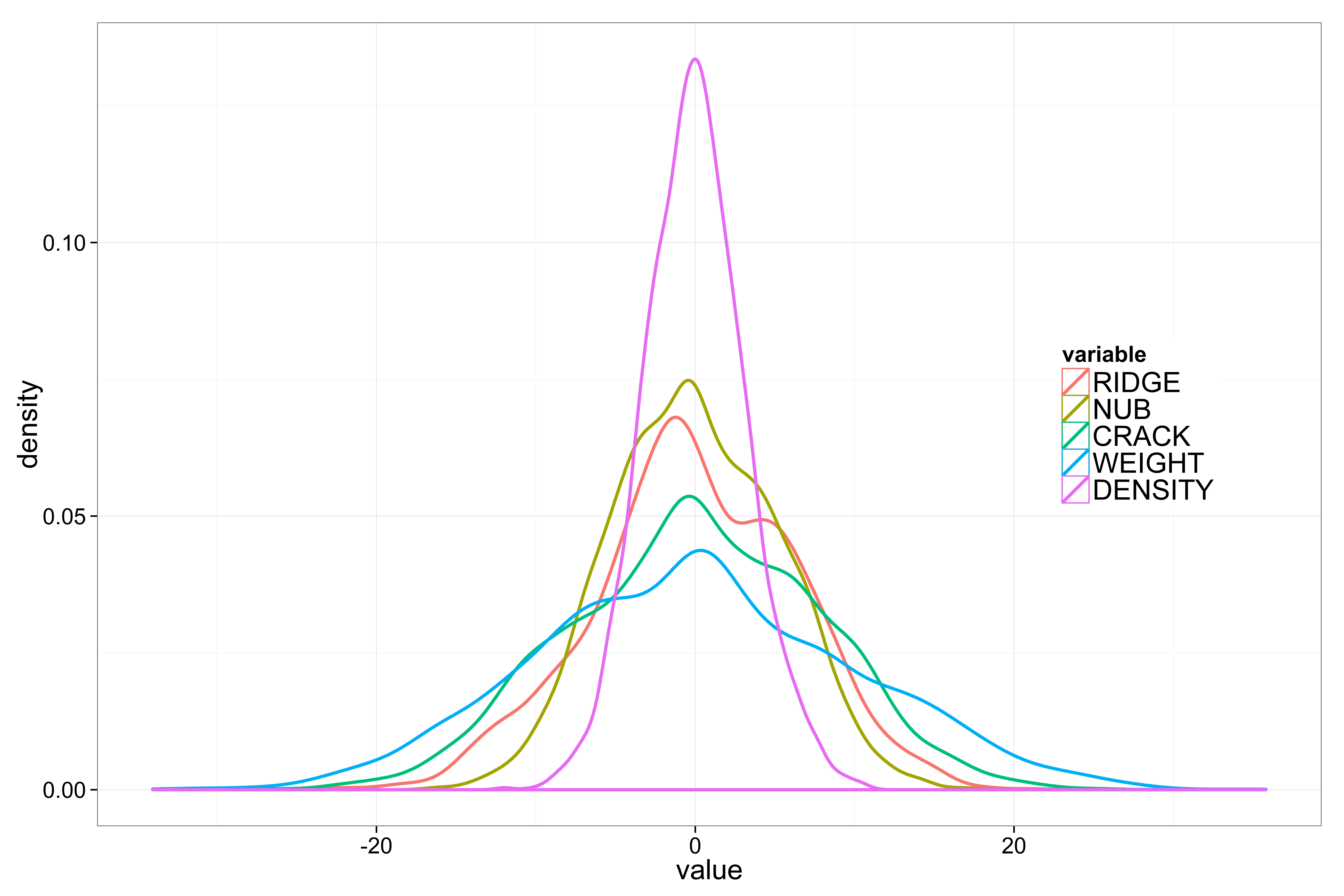
Interestingly, the previous ||-Coordinates plot also shows a small, dense region near zero — a concentration that is atypical for purely normally distributed data. This anomalous cluster may explain the central peak seen in the density plot. To better understand its structure, we zoom into this region and attempt to isolate the cluster.
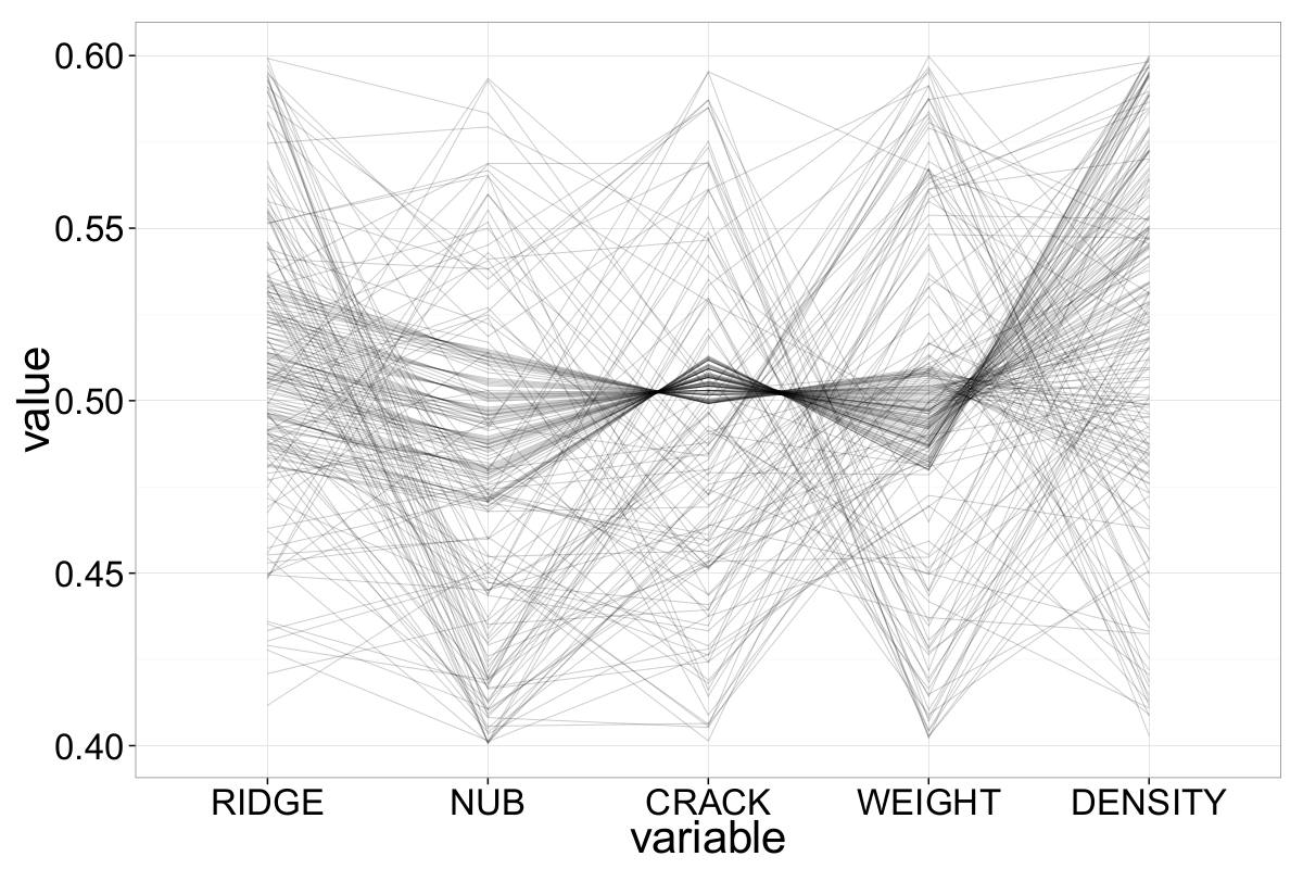
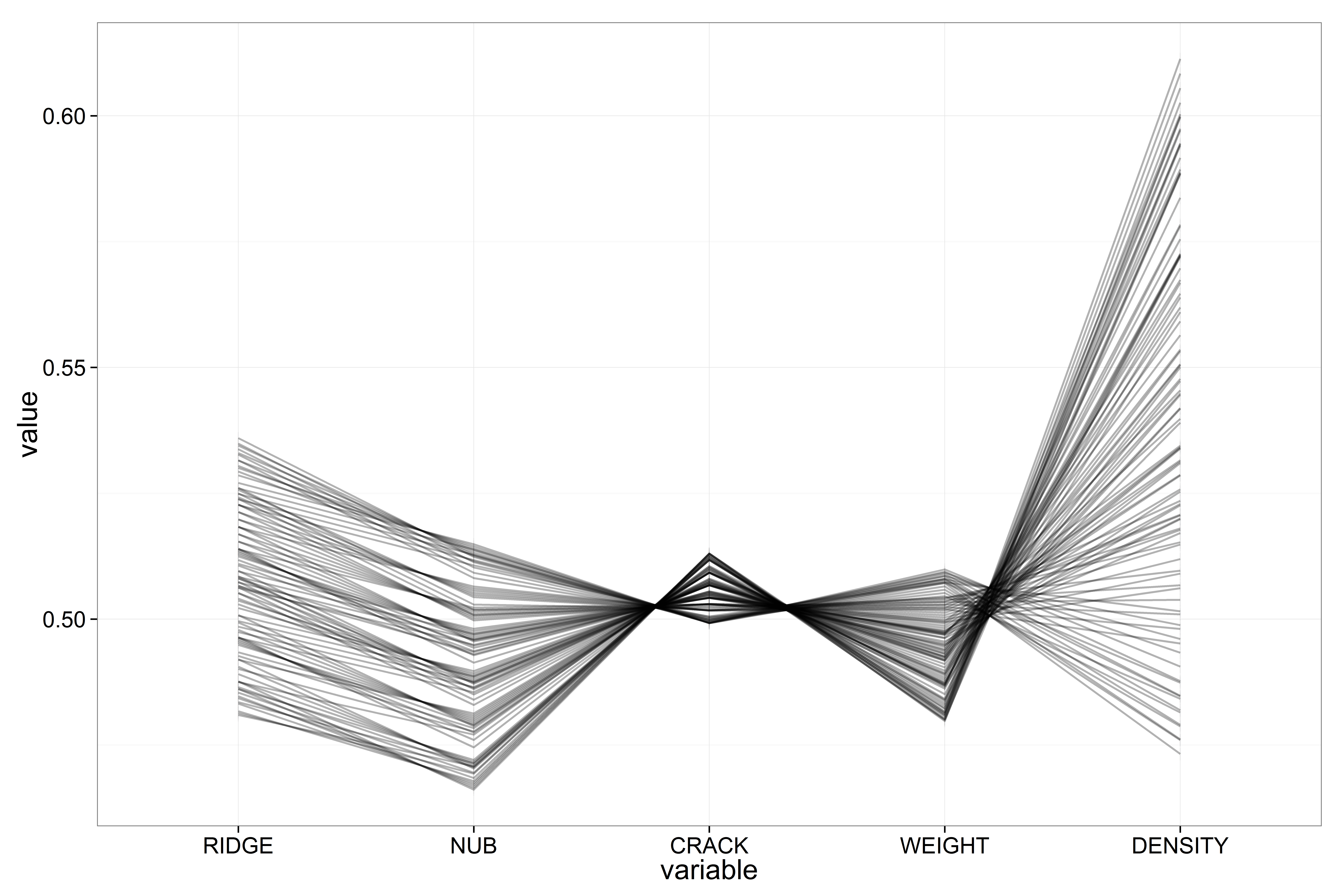
Figures 6 and 7 clearly reveal that the cluster contains structured, non-random patterns. Linear relationships between attributes become apparent — for example:
- Ridge and nub are positively correlated
- Nub and crack, crack and weight, and weight and density show negative correlations
Reordering the axes using the ||-Coordinates-Matrix confirms that nearly all attribute pairs exhibit linear relationships within this subset.
To investigate further, we generate a scatter plot matrix of the extracted cluster. The result unveils a surprising twist: the observations are arranged such that the scatter plots of many attribute pairs spell out the word “EUREKA” — as shown in Figure 8 for the pair weight vs. density.
This planted structure explains the previously observed anomaly and provides an intriguing example of how synthetic or hidden signals can manifest in high-dimensional data visualizations.
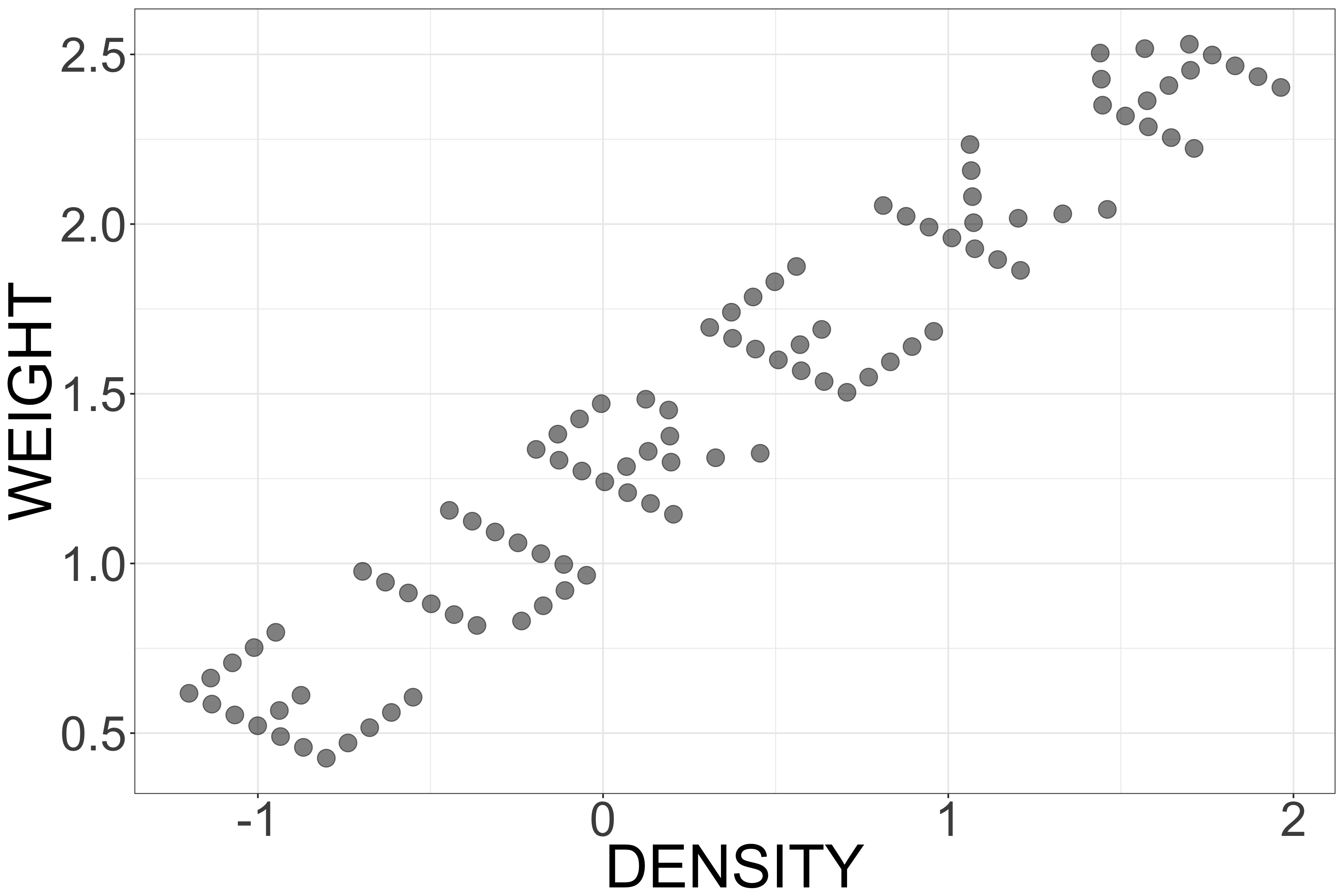
This striking discovery confirms that the dataset was entirely synthetic. Both the variable names and the dataset’s title — referencing biological terminology like ridge, nub, crack, and pollen — were deliberately chosen to mislead participants into believing the data was biologically meaningful.
In reality, the dataset was constructed as a puzzle for the ASA Exposition competition, embedding a hidden message within the data structure to challenge data visualization and analysis techniques. This example demonstrates how deceptive a dataset’s surface characteristics can be — and how powerful visualization techniques like ||-Coordinates can uncover underlying truths.
The OUT5D Dataset
In this section, we apply ||-Coordinates to the Out5d dataset to explore potential patterns and correlations within the data.
We begin by generating a basic ||-Coordinates plot without any parameter adjustments:
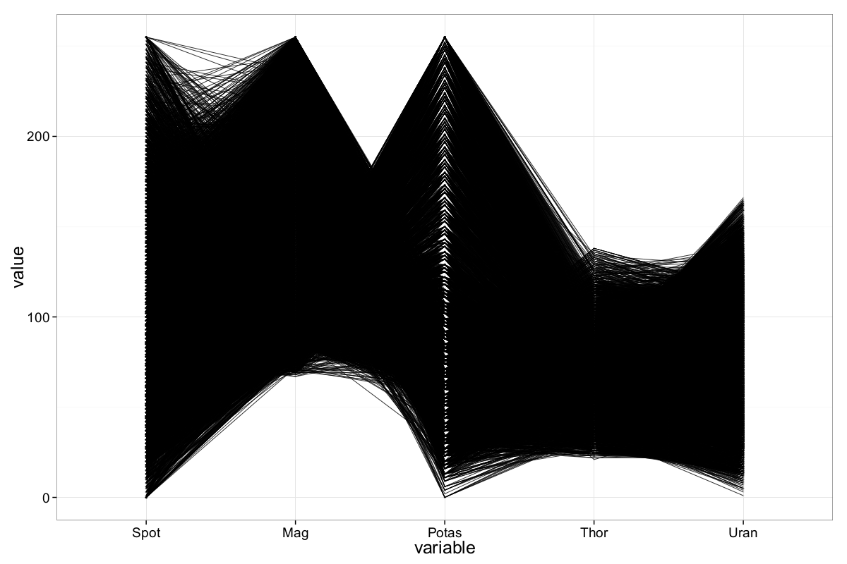
As expected, the plot suffers from heavy overplotting due to the dataset’s size (16,384 observations), making it difficult to extract meaningful insights at first glance. Nevertheless, a few basic characteristics are apparent:
- All values are non-negative.
- The maximum values for the first three axes (spot, magnetics, and potassium) are around 255 — the output of R’s
summary()function confirms this, suggesting that 8-bit (byte) variables were used to store the data. - No clear outliers are visible in this initial rendering.
- There appears to be a region of higher density on the magnetics and potassium axes, potentially indicating negative correlation for some observations. However, due to the visual clutter, this is merely a hypothesis at this stage and requires deeper investigation using enhanced visualization techniques.
To reduce the visual clutter in the previous ||-Coordinates plot, we apply alpha blending with a transparency value of \(\alpha = 0.01\):
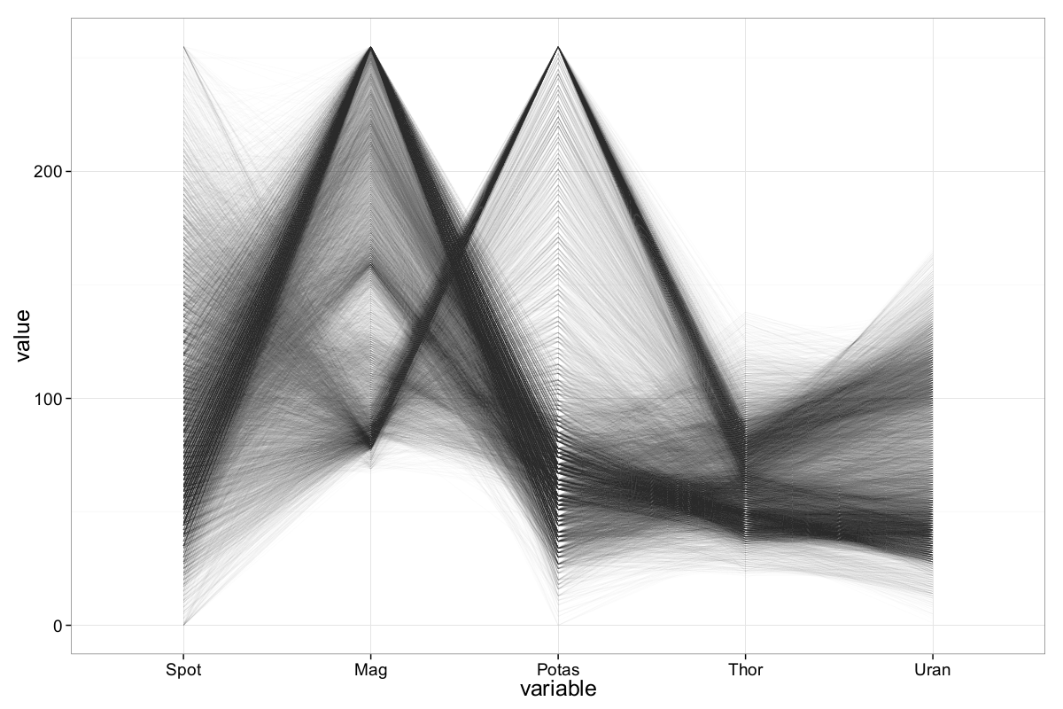
The applied transparency significantly reduces overplotting and makes underlying patterns more discernible. However, a certain amount of clutter still persists.
One technique to further declutter ||-Coordinates plots—especially useful when dealing with negative correlations—is axis inversion. This reduces the number of intersecting lines and helps clarify relationships between variables. We apply this technique by inverting the magnetics axis, which already showed signs of potential negative correlation with other attributes.
The resulting plot is shown in Figure 11:
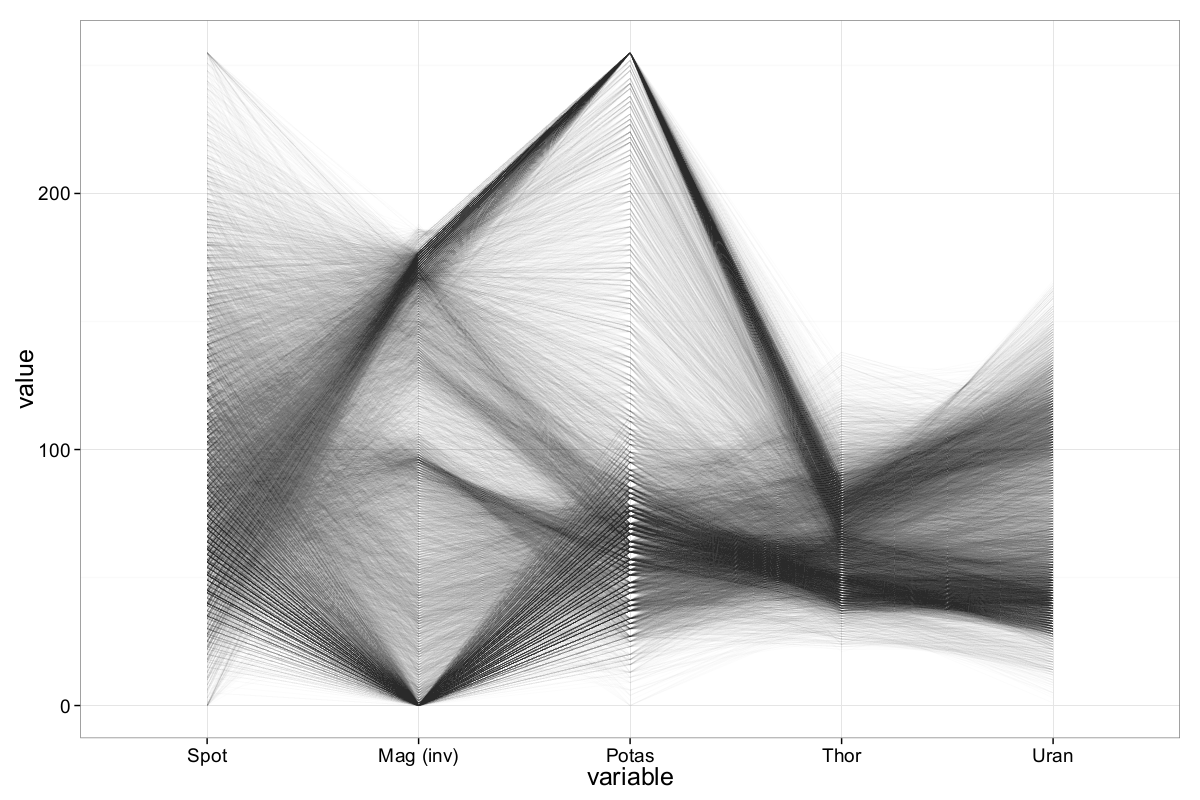
After inversion, clearer patterns emerge:
- The magnetics axis shows a bimodal distribution, with clusters above 250 and below 100.
- The potassium axis reveals a notable saturation at its maximum value (255), suggesting potential sensor clipping or quantization.
- A strong negative correlation between magnetics and potassium becomes visible.
- Additional inter-attribute correlations begin to emerge, warranting further inspection.
On the magnetics axis, we observe two prominent concentration regions: one above 250 and another below 100. For potassium, many records reach the maximum value of 255, which supports the earlier assumption that the dataset uses byte-encoded variables.
As previously suspected, there appears to be a negative correlation between magnetics and potassium—records with high magnetics values tend to correspond to lower potassium values. Interestingly, while high magnetics values seem to align with low spot values, low magnetics values distribute more evenly across the spot axis, suggesting a more complex relationship.
More generally, records with extreme magnetics values (both high and low) can be somewhat separated in the other radiometric dimensions (potassium, thorium, and uranium), indicating the presence of potentially meaningful clusters.
To further explore these structures, we apply brushing to highlight and isolate three different sample groups in the ||-Coordinates plot with the inverted magnetics axis:
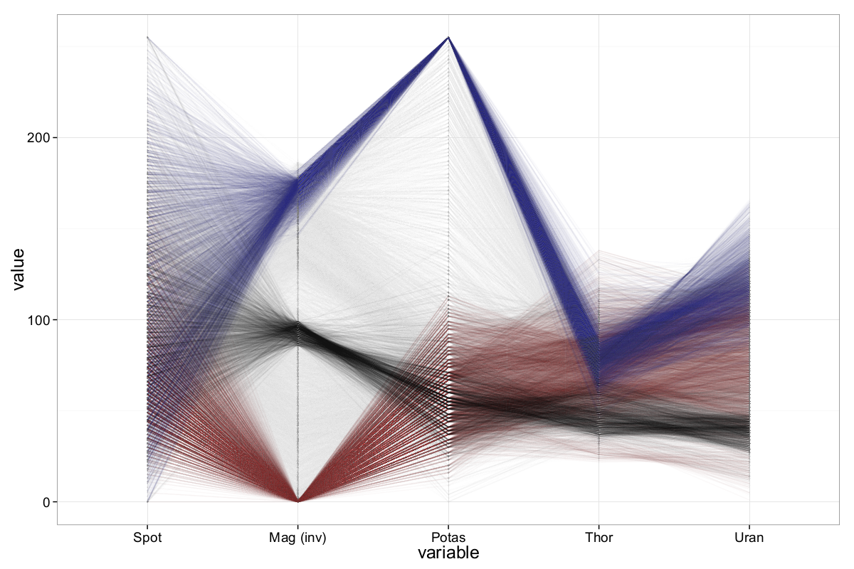
The brushing reveals:
- Black group: Observations centered around a mid-range magnetics value (~155). These appear to form a dense cluster, possibly indicating a dominant geophysical signature.
- Blue group: Samples with high potassium values. These also show distinct behavior in other dimensions, forming a relatively consistent cluster.
- Red group: Records with high magnetics values, generally showing low potassium levels—though this relation is weaker than in the blue group.
This analysis suggests that Out5d contains internal structure and subgroups, which could reflect different geological zones or material compositions across the scanned area.
To be more precise (according to the figure above), a negative correlation between magnetics and potassium is clearly visible, though it exhibits certain nuances. Specifically, high potassium values tend to correspond to low magnetics values, and conversely, high magnetics values generally align with relatively low potassium values. However, this relationship is not symmetric: while high potassium strongly implies low magnetics, low potassium values are more broadly distributed across the magnetics axis and do not necessarily imply high magnetics values.
A dense cluster of observations can be found around the value 100 on the (inverted) magnetics axis — which corresponds to an actual value of 155. We count approximately 1300 records in the range \([155, 170]\), in contrast to only around 340 records in the range \([135, 150]\). These mid-range magnetics observations, along with two other subsets, are highlighted in Figure 12 using brushing.
Notably, most of the black-brushed samples (centered around magnetics = 155) cluster not only on the magnetics axis but also align closely in the remaining four dimensions — with the exception of spot. Similarly, the blue-brushed samples (with high potassium) form a fairly compact and well-separated cluster. The red samples (high magnetics) are more spread out in their other dimensions, suggesting weaker or more complex dependencies.
To gain deeper insight into the inter-variable relationships, we employ the so-called ||-Coordinates-Matrix (PCM). The PCM visualizes all pairwise attribute combinations using multiple ||-Coordinates plots. Since Out5d consists of five attributes, only two such plots are needed to display all pairwise relations.
To construct these plots systematically, we compute all Hamiltonian paths on the complete graph with \(N=4\) vertices (ignoring one attribute temporarily). Then, the fifth attribute is appended to both the start and end of each row in the matrix to form a complete Hamiltonian cycle. This ensures all pairwise combinations are displayed at least once. For the Out5d dataset, exactly two such Hamiltonian cycles are possible:
\[\begin{equation} H = \begin{pmatrix} d_5 & d_1 & d_2 & d_4 & d_3 & d_5 \\ d_5 & d_2 & d_3 & d_1 & d_4 & d_5 \end{pmatrix} \label{ch5:eq:hamiltonianOUTfD} \end{equation}\]Using this matrix, it is possible to visualize all pairwise relationships among the five attributes of the Out5d dataset with just two ||-Coordinates plots.
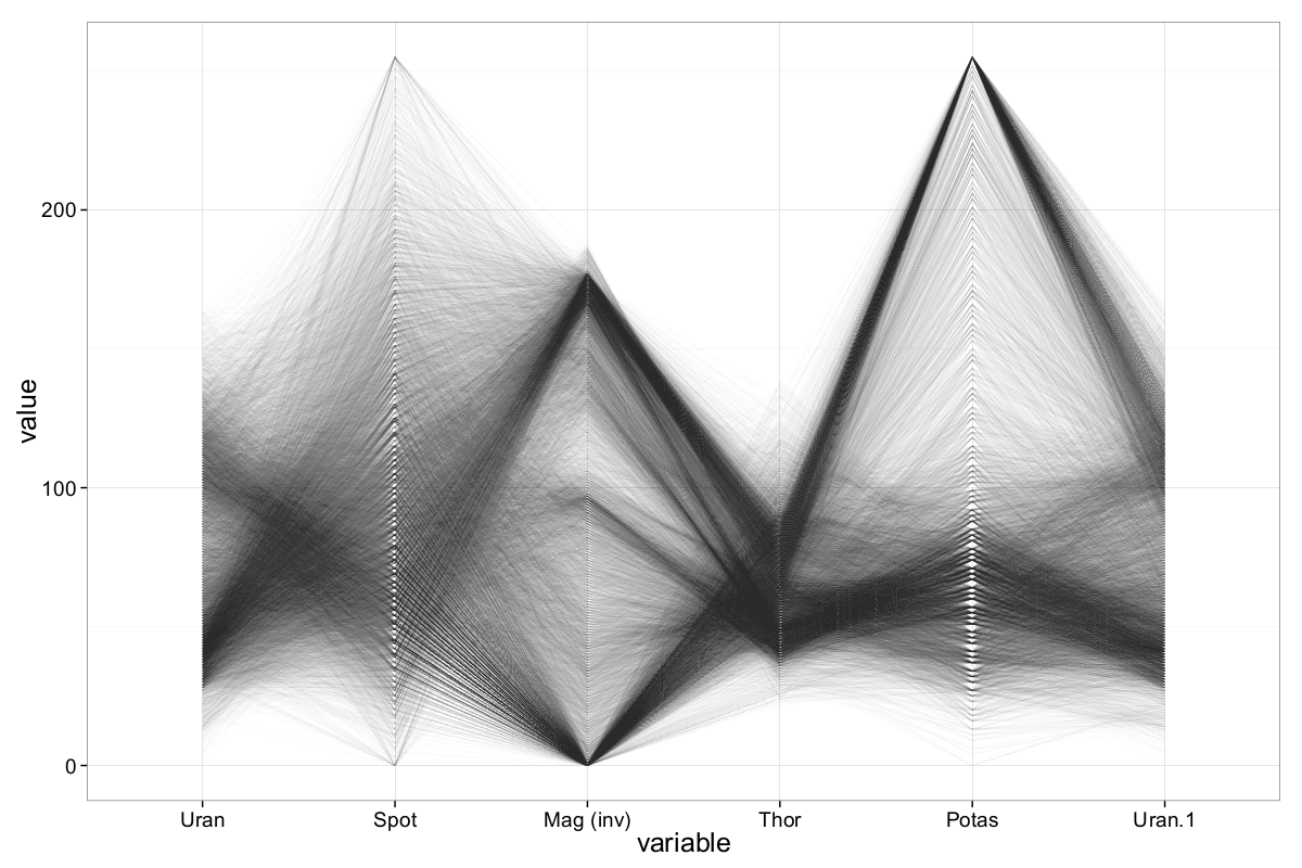
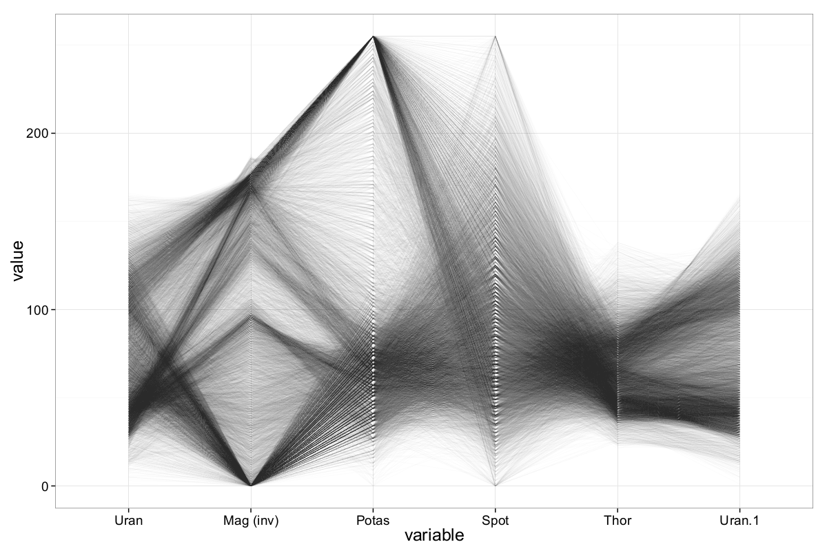
The ||-Coordinates-Matrix reveals several additional patterns in the Out5d dataset. For example, the pairwise relationship between uranium and magnetics uncovers structures that were previously less apparent. Similarly, a noteworthy relation between potassium and uranium emerges, which was not observed in earlier visualizations.
Many of the clusters previously identified in (G. Palmas et al., 2014) — though limited to a subset of attribute combinations — are also clearly visible in our ||-Coordinates-Matrix. In (Malik & Ünlü, 2011), Malik and Ünlü use Parallel Coordinates to describe a strong negative correlation between magnetics and potassium, a finding that is confirmed in our analysis. Furthermore, (Bertini et al., 2005) combine ||-Coordinates with Radviz (Radial Visualization) and identify clusters where low values of thorium, potassium, and uranium correspond to high magnetics values — and vice versa, a cluster with high uranium and potassium but low magnetics. Our plots support these findings as well.
Although the Out5d dataset serves primarily to illustrate key features of ||-Coordinates in this example, the structure of the data hints at potentially anomalous records. As also noted by (Malik & Ünlü, 2011), both magnetics and potassium contain about 20% of observations at the maximum value of 255. While this is not inherently problematic, the lack of detailed metadata about the dataset warrants caution when interpreting these values.
In each row of the ||-Coordinates-Matrix, the attribute uranium appears twice — once at the beginning and again at the end of the sequence. This ensures that all pairwise relationships are properly represented within the constraints of the Hamiltonian cycles used to build the matrix.
The Out5d dataset has been analyzed in several previous publications. Here, we briefly compare findings from those studies with the insights presented in this blog post. For a more comprehensive overview, refer to the citations mentioned earlier.
Many of the clusters identified in (G. Palmas et al., 2014) — although limited in scope due to not covering all attribute combinations — are clearly visible in our ||-Coordinates-Matrix. In (Malik & Ünlü, 2011), Malik and Ünlü describe a strong negative correlation between magnetics and potassium, which is also evident in our visualizations. They further report the presence of individual outliers across multiple dimensions.
In (Bertini et al., 2005), the authors enhance ||-Coordinates with Radviz to aid the clustering process. Their findings show that low values in thorium, potassium, and uranium often correspond to high values in magnetics. Conversely, they observe a cluster characterized by high uranium and potassium values paired with low magnetics. These patterns are consistent with what is observed in our ||-Coordinates-Matrix (see Fig. 13), reinforcing the value of this visualization technique in uncovering meaningful structures in multidimensional data.
The Wine Quality Dataset
Following the previous methodology, we now explore the Wine Quality dataset using ||-Coordinates plots. The main objective is to detect patterns in the data that relate to wine quality — for both red and white wines — and to uncover the most prominent differences between them.
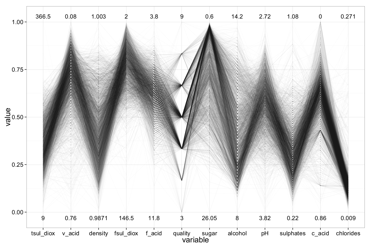
Given the large number of observations, visualizing the entire dataset (even when separated into red and white wine subsets) using standard ||-Coordinates plots is not advisable, as it would result in a high degree of overplotting. As a first countermeasure, alpha-blending is applied to reduce visual clutter and gain a more interpretable overview.
However, simply applying alpha-blending is not sufficient. The default column ordering does not optimize readability, so the plot remains somewhat cluttered. By leveraging the ||-Coordinates-Matrix (PCM) to find more effective axis orderings and inverting certain axes, the clutter can be further reduced. In total, six ||-Coordinates plots are required to fully represent all pairwise relationships in the dataset.
To improve the distribution and legibility of the lines, we also remove a small number of extreme outliers from the dataset. Specifically, 31 samples are removed from the white wine dataset and 17 from the red wine dataset. These removed samples do not belong to the best- or worst-rated wines and thus do not affect the key quality groups.
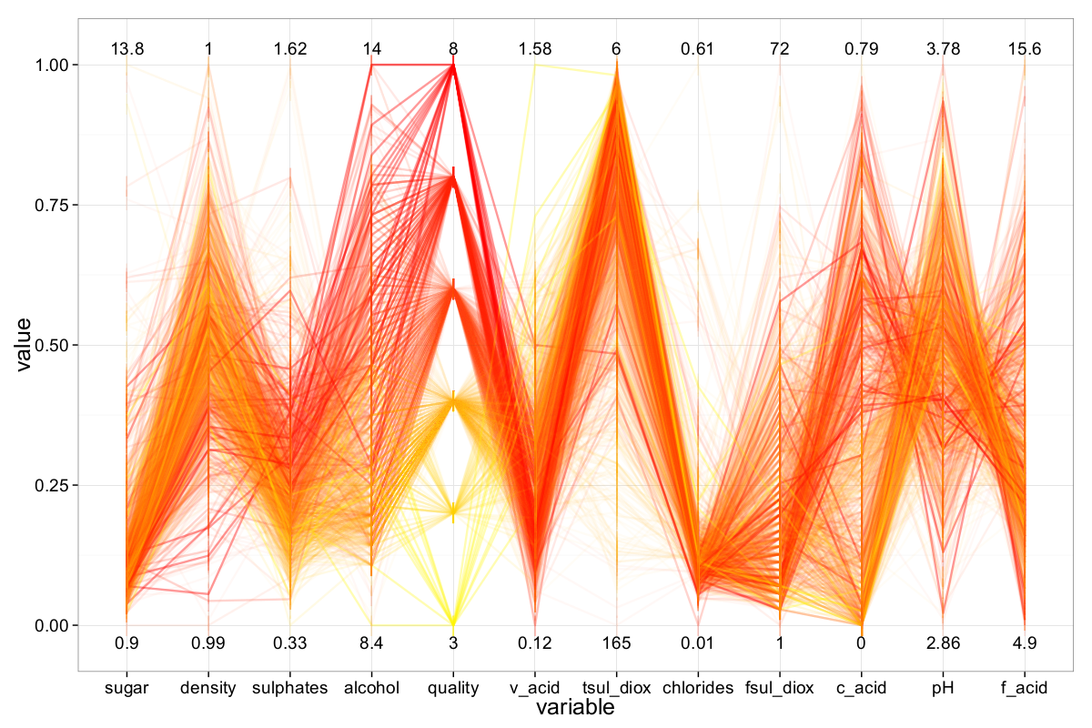
Figure 14 shows the resulting plot for the white wine dataset. It provides an informative first overview of the data, including the range of values, emerging clusters, and other notable structures. A similar approach is applied to the red wine dataset. However, detailed insights about wine quality are still limited: very few white wines received a quality rating of 9, and no red wines achieved that score. Conversely, poor-quality wines are also rare, with the lowest ratings being 3 for both red and white wines.
In order to better understand how the objective attributes influence wine quality, we implement a coloring scheme in our R-based ||-Coordinates plot. Each sample is colored according to its assigned quality using a heat-based color model: low-quality wines are shown in yellow, while high-quality wines appear in red. This color gradient helps visualize quality-related patterns across the dataset.
As before, we refine the plot by selecting a suitable axis configuration using the ||-Coordinates-Matrix and inverting specific axes to minimize clutter. Additionally, directly comparing the best and worst wines—by brushing the respective subsets—within a ||-Coordinates plot can reveal broader correlations between quality and the chemical properties of the wines.
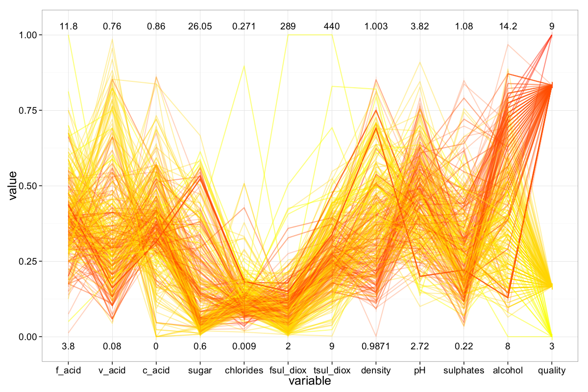
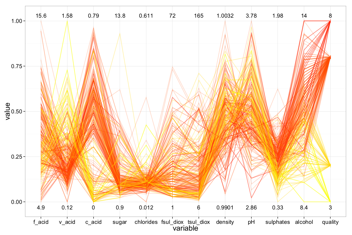
To better explore how individual attributes influence wine quality, the most relevant variables — such as alcohol, density, and volatile acidity — are positioned closest to the quality axis. The resulting ||-Coordinates plot for the white wine dataset is shown below.
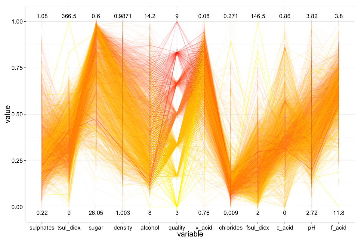
We identified the attributes alcohol, density, and volatile acidity (in descending order) as the most important for predicting quality in the white wine dataset. Generally, white wines with higher alcohol content tend to have higher quality ratings. For instance, the average alcohol concentration among wines rated 7 or higher is approximately 11.5%, whereas wines rated 5 or lower average around 9.8% — a notable difference given the full range of alcohol values is $[8\%, 14.2\%]$.
The second most influential attribute is density. Wines with lower density — which often correlates with higher alcohol content — are typically rated higher in quality. (Note: the density axis is inverted in Figure 16.) A similar pattern is visible with volatile acidity: lower values generally correspond to higher-quality wines, although the correlation is not as pronounced as with alcohol and density.
The ||-Coordinates plot also reveals several additional insights. For example, while sulphates does not appear globally important, wines with high sulphates concentrations (greater than 0.75 g/dm³) are mostly associated with higher quality. Another clear pattern is the negative correlation between pH and fixed acidity — higher fixed acidity corresponds to lower pH values, which is chemically plausible. (The fixed acidity axis is also inverted.) A similar, albeit weaker, effect is observed between citric acid and pH.
Interestingly, our findings differ somewhat from those of Cortez et al. (Cortez et al., 2009), who identified sulphates as the most important attribute, followed by alcohol, residual sugar, and citric acid. This discrepancy is likely due to their use of Support Vector Machines for regression, which rely on different importance measures than visual analysis. In contrast, Nachev and Stoyanov (Nachev & Stoyanov, 2012) — using symmetrical uncertainty — ranked alcohol, density, and chlorides as the top predictors. Our own Random Forest model supports the visual findings and highlights alcohol, density, and volatile acidity as the most relevant attributes.
For the red wine dataset (Figure 17), alcohol once again stands out as the most influential factor on wine quality — higher alcohol content clearly correlates with better quality ratings. Unlike the white wines, however, density does not provide meaningful insight into red wine quality. Instead, sulphates emerge as a more informative attribute: higher concentrations are associated with better-rated red wines.
Another notable pattern is that poorly rated red wines tend to exhibit low citric acidity and high volatile acidity, while higher-quality wines show the opposite trend — higher citric acidity and lower volatile acidity.
As with the white wines, a negative correlation is observed between pH and fixed acidity, as well as between pH and citric acidity, reinforcing the inverse chemical relationship between acidity and pH levels in the dataset.
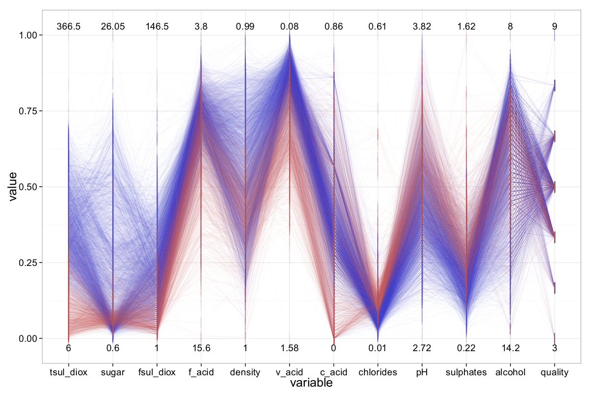
Finally — as the last step in this section — we investigate the main differences between red and white wines. The ||-Coordinates plot comparing both wine types is shown in Figure 18. The differences between red and white wines are easily recognizable. For example, the amount of total sulfur dioxide is noticeably lower in red wines compared to white wines. In addition, red wines generally contain less residual sugar and free sulfur dioxide. Differences across most other attributes can also be observed. Based on visual inspection, the attributes total sulfur dioxide, residual sugar, and free sulfur dioxide appear to be the most relevant for distinguishing between red and white wines.
The MiniBooNe Particle Identification Dataset
The MiniBooNe dataset is the final dataset we analyze using Parallel Coordinates. It has the highest number of observations (130,065) and dimensions (50, excluding the class label), which makes processing particularly challenging — both for the techniques used and for the available hardware. Our R implementation of ||-Coordinates struggles with this large volume of records; generating a single plot takes an impractically long time.
To address this, we randomly sample the dataset to reduce the number of observations. Unless otherwise stated, we use a sample size of 20,000 records.
The MiniBooNe dataset includes 36,499 signal events and 93,565 background events, making it highly imbalanced. A random sample would inherit this imbalance unless explicitly corrected. Since we aim to give equal weight to both classes, we randomly select 10,000 instances from each class for further analysis.
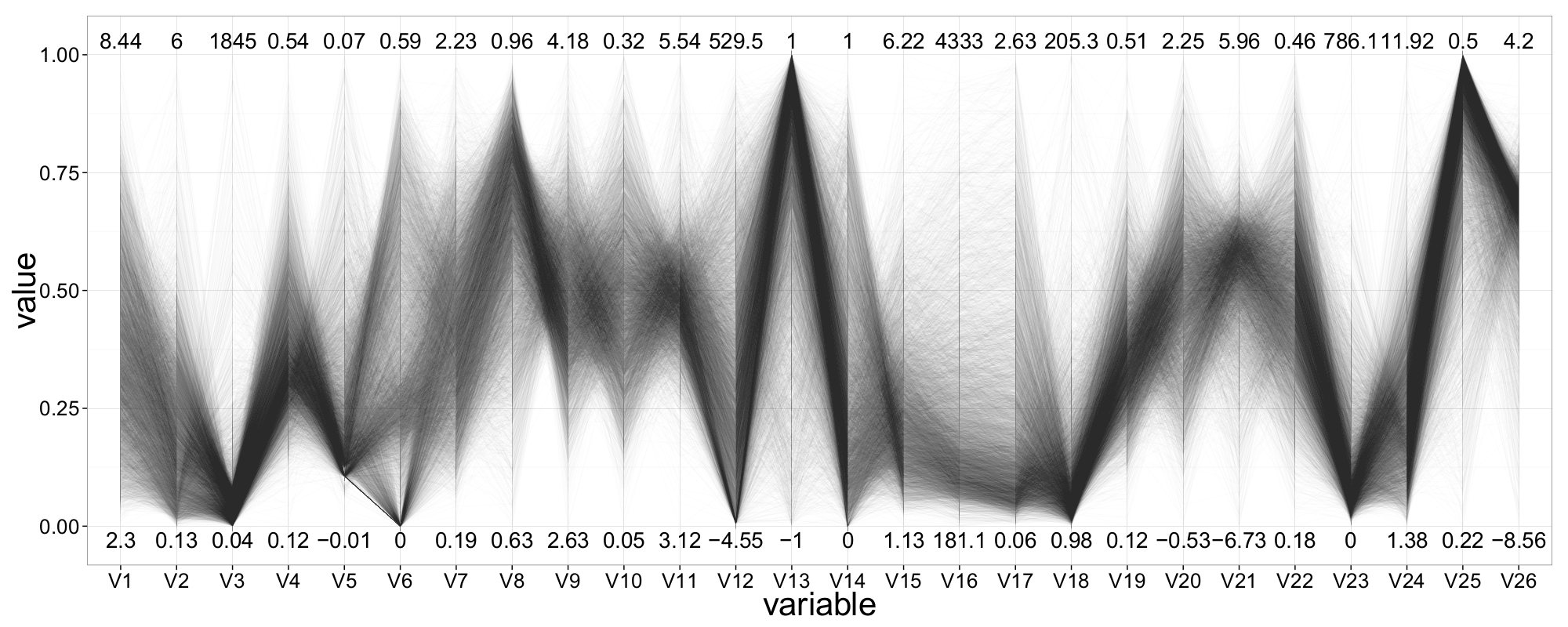
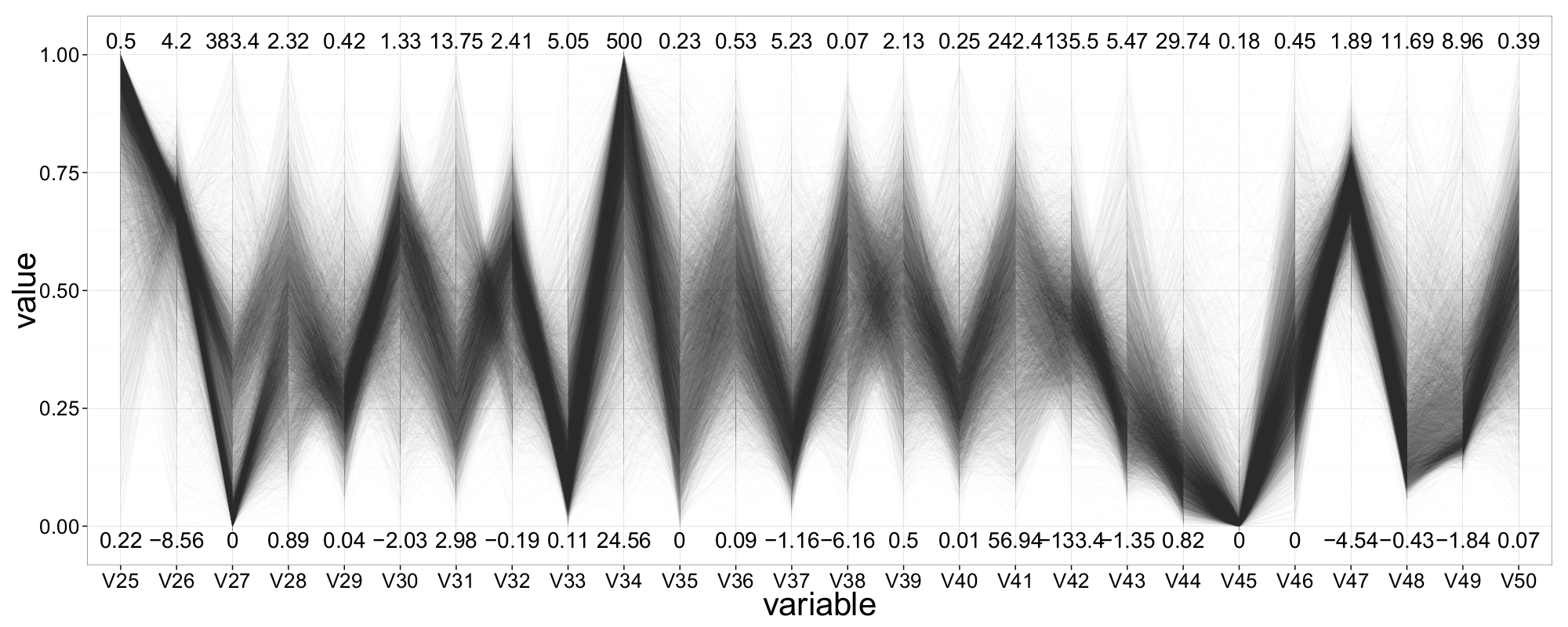
A first ||-Coordinates plot of the selected 20,000 observations reveals that many attributes contain a minimum value of \(-999\). These likely represent missing or invalid entries. In total, 468 such records are found and removed from the dataset. Additionally, we automatically filter out extreme outliers—amounting to no more than 1% of the data—to improve the readability of the plot.
An updated ||-Coordinates plot, now containing all 50 attributes, is shown in Figure 20. Despite the large number of observations and dimensions, many patterns in the data begin to emerge. We gain a first overview of the value ranges across all attributes; many of them appear to follow a roughly normal distribution.
Looking more closely at the segment between V38 and V39, we observe a typical hyperbolic shape—indicative of two normally distributed variables. Beyond that, other patterns become apparent: attributes such as V1 and V17 seem to offer good class-separation, whereas attributes like V34, V41, and V50 do not appear useful for distinguishing between classes.
We also notice varying data densities across different regions of the plot. For instance, signal events are widely dispersed between V15 and V17, while background events appear more concentrated. In this region, several correlations among adjacent variables are visible: V16 and V17 seem positively correlated, while V31 and V32 exhibit a negative correlation.
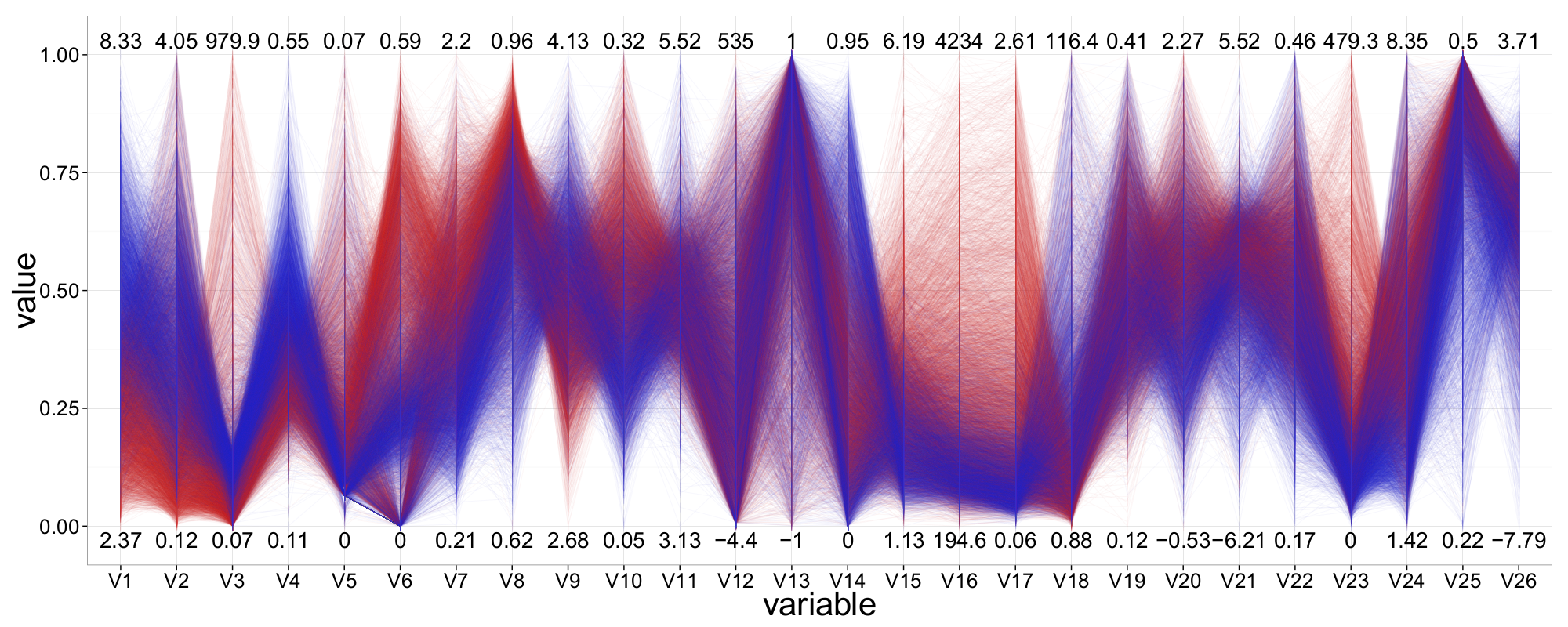
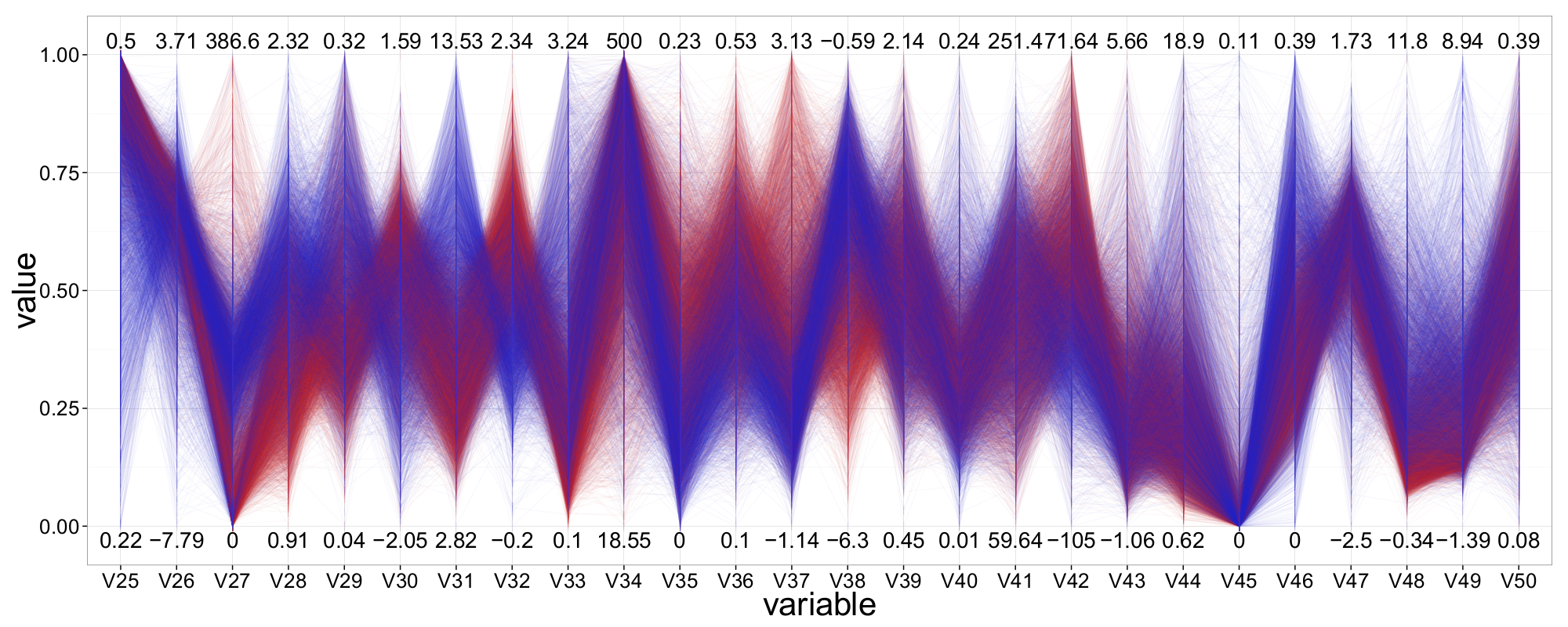
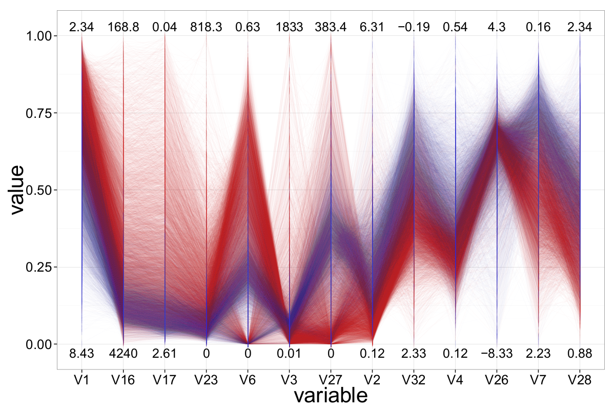
As mentioned earlier, not all 50 attributes appear suitable for (visual) classification. In the following, we aim to identify the most significant variables and focus our analysis on them. Figure 21 presents a ||-Coordinates plot containing only those attributes which, after extensive experimentation—including axis reordering and inversion—we found most effective for distinguishing between signal events and background events. In total, 13 attributes were selected, and the most informative configuration was determined using the ||-Coordinates-Matrix.
A first qualitative assessment suggests that variable V1 offers the strongest class-separation, followed by V17 and V16. Interestingly, all three are also ranked among the top five most important features according to a Random Forest model. Additionally, V3 appears to have useful class-separating properties, although the majority of samples are concentrated in the lower value range on its axis.
Although ||-Coordinates is primarily a visualization technique and not typically used for direct classification, the human ability to detect relationships and patterns in visualized data makes it a valuable tool for evaluating, adjusting, and verifying algorithmic classification approaches. It is even conceivable to incorporate geometric features—such as the slope or proximity of polygonal lines—into the design and support of classification algorithms.
By integrating such geometric characteristics as additional decision variables, classification models like decision trees could potentially be enhanced. For example, the slope of a polygonal line across certain segments might serve as a better class-separating feature than the raw attribute values themselves.
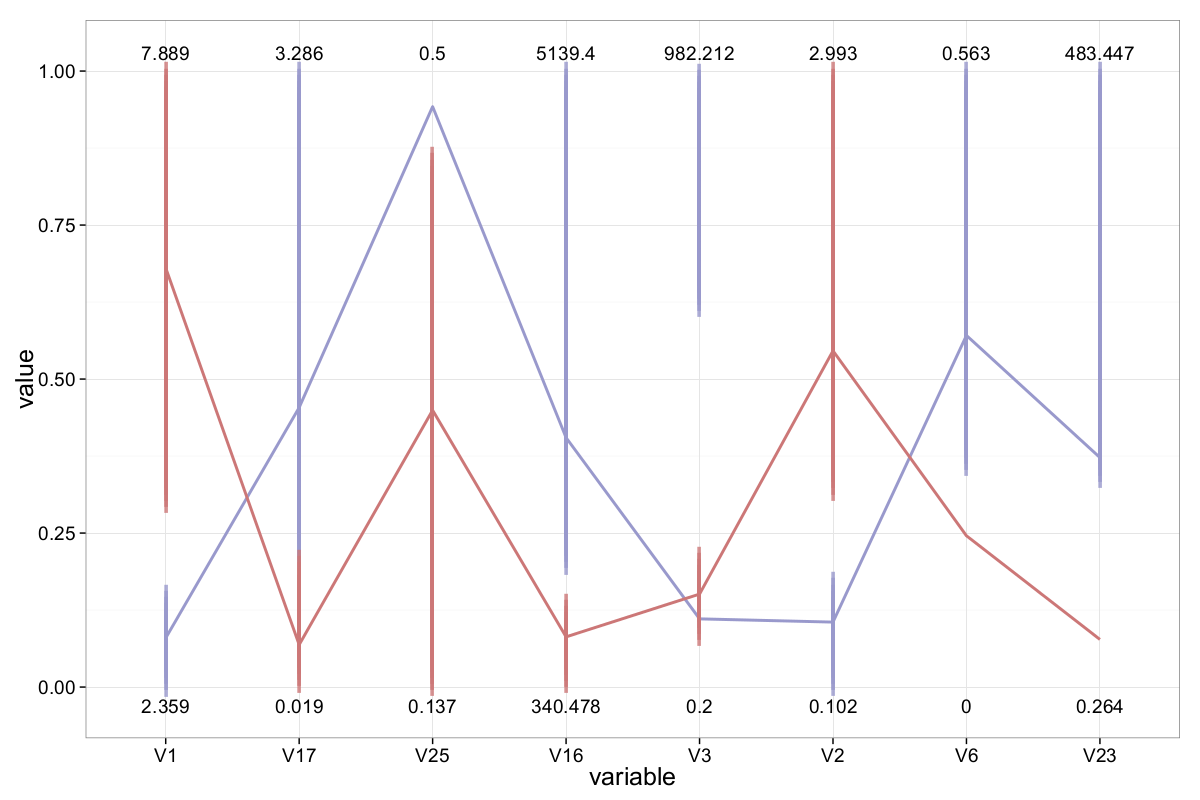
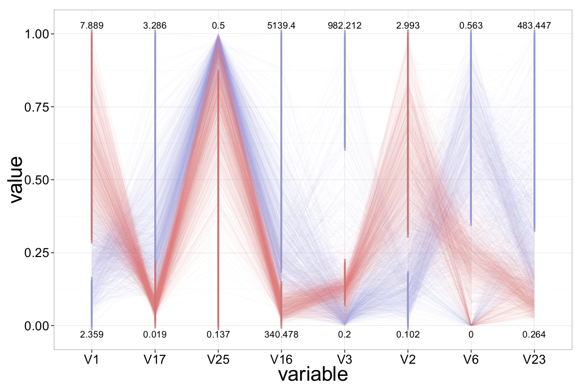
Based on our visual analysis so far, we propose a simple, intuitive classifier. Its structure and behavior are illustrated in the figures below:
Discussion and Conclusion
In this blog post, we presented ||-Coordinates, a visualization technique developed by Alfred Inselberg for analyzing multidimensional and multivariate data. We discussed the fundamental properties of ||-Coordinates and applied the method to several datasets varying in dimensionality, number of attributes, and attribute characteristics, in order to explore its strengths and limitations.
While designing a (visual) classifier using parallel coordinates is not straightforward, future research could explore how geometric features of ||-Coordinates — such as the slope and proximity of the polygonal lines — might be used to support or enhance traditional classification algorithms.
As a case study, we analyzed a dataset containing around 6,500 Portuguese red and white wines. Each wine is described by 11 objective attributes (e.g., alcohol content, pH, density), along with a 12th attribute: quality, as assessed by wine tasters.
We began our exploration with the Pollen dataset, which served as an introductory example. With standard ||-Coordinates, insights were limited due to heavy overplotting from the high number of observations. However, once alpha blending was introduced, a clear cluster emerged. Visualizing this cluster in a scatter plot ultimately revealed the hidden structure of the data.
Overall, ||-Coordinates prove to be a powerful tool for gaining visual intuition about complex datasets, particularly when enhanced with interactive or perceptual techniques such as axis reordering, inversion, or transparency.
The second dataset we analyzed was the Out5d dataset. While its number of dimensions is relatively small and easily handled by ||-Coordinates, the large number of observations (16,384 in total) presented a challenge. Once again, alpha blending proved effective in mitigating the overplotting problem and reducing visual clutter. This example also highlighted the usefulness of the ||-Coordinates-Matrix for identifying patterns or clusters within the data, offering more informative and diverse perspectives.
The main task for the wine-quality dataset, our third example, was to explore the relationship between 11 objective attributes and the subjective wine quality rating. In addition to alpha blending and axis reordering, we found that axis inversion can be a powerful tool for reducing clutter—especially in the presence of negative correlations. By applying a heat-based color scheme based on wine quality, we were able to visually assess the influence of specific attributes on the overall quality of the wines.
The final dataset we explored—the MiniBooNe particle identification dataset—featured the highest dimensionality (51 attributes) and the largest number of observations (over 130,000) of all our examples. Due to computational constraints, we limited our analysis to a random subset of 20,000 samples. Because finding meaningful patterns among all 50+ attributes was difficult, we reduced the attribute space to the 13 most promising features, based on their visual class-separating properties. After reordering and inverting axes as needed, we were able to generate a configuration that provided a clear separation between the two target classes.
Overall, we found ||-Coordinates to be a suitable and helpful tool for data-mining tasks—provided it is applied thoughtfully and adapted to the specific dataset. One of the key advantages of this technique is its interpretability: although it is based on a complex underlying theory, ||-Coordinates can be easily applied and understood, even by users with limited experience.
One recurring issue we faced, particularly with larger datasets, was overplotting—where too many overlapping lines obscure important patterns. To mitigate this, we used a density-based technique known as alpha blending, which introduces transparency and helps make clusters and other structures visible.
In our experience, ||-Coordinates often revealed relationships—such as linear correlations or normal distributions (indicated by hyperbolic envelopes)—more clearly than other visualization techniques like heatmaps or dimensional stacking. For example, in the Pollen dataset, which contained mostly random noise, the method still uncovered structured patterns. However, we also occasionally misinterpreted correlations, especially negative ones. These false assumptions were often corrected by inverting the corresponding axis, which negates the slope of the polygonal lines in that segment and can significantly reduce clutter.
As with dimensional stacking, axis configuration plays a critical role in revealing patterns. To address this, we introduced the ||-Coordinates-Matrix, which allows users to examine all pairwise relationships between attributes using a relatively small number of plots.
Once a suitable axis configuration was identified, ||-Coordinates proved to be a powerful tool for identifying clusters across multiple dimensions, leveraging features such as line proximity, slope, and density. In this regard, it outperformed both heatmaps and dimensional stacking, which were less effective for clustering.
Unlike heatmaps—where color is already used to represent values—||-Coordinates offer the flexibility to use color for additional layers of information, such as class labels or quality scores.
Despite its advantages, our implementation of ||-Coordinates could not handle extremely large datasets efficiently. For instance, we had to sample the MiniBooNe dataset, whereas dimensional stacking could display all observations (albeit limited to around 10 dimensions). Nevertheless, when comparing plots generated from different sample sizes, we found that the main structures were preserved, suggesting that ||-Coordinates is a robust visualization technique.
Another challenge we encountered was the handling of outliers. While they are easy to detect in ||-Coordinates, they can distort the scale and compress the majority of data into a narrow region, making interpretation difficult. This limitation also applies to heatmaps and dimensional stacking.
In summary, when used with appropriate preprocessing and thoughtful configuration, ||-Coordinates can be a highly effective tool for exploring high-dimensional datasets.
Even though we encountered several challenges early on—most notably overplotting—we were able to uncover many interesting insights from the analyzed datasets using ||-Coordinates. Unfortunately, not all of these findings could be included in this blog post. Still, it was remarkable to observe how a relatively simple technique like ||-Coordinates—without requiring significant extensions or enhancements—was capable of revealing patterns, relationships, and other hidden structures in raw data.
References
- The plane with parallel coordinates.The Visual Computer, 1985
- Exploring N-Dimensional Databases.In Visualization, 1990, 1990
- Parallel Coordinates: Visual Multidimensional Geometry and Its Applications.In Knowledge Discovery and Information Retrieval, 2012
- Multidimensional detectiveIn IEEE Visualization 1997, 1997
- Visual Complexity and Intelligent Computer Graphics Techniques Enhancements2009
-
- Parallel Coordinates: A Tool for Visualizing Multi-dimensional GeometryIn IEEE Visualization 1990, San Francisco, California, 1990
- Parallel Filter: A Visual Classifier Based on Parallel Coordinates and Multivariate Data AnalysisAdvanced Intelligent Computing Theories and Applications. With Aspects of Artificial Intelligence, 2007
- A Visual Analytics Approach for Correlation, Classification, and Regression Analysis2012
- Enabling Automatic Clutter Reduction in Parallel Coordinate Plots.IEEE Transactions on Visualization and Computer Graphics, 2006
- The Parallel Coordinates MatrixIn EuroVis, 2012
- Combining automated analysis and visualization techniques for effective exploration of high-dimensional data.In IEEE Visual Analytics Science and Technology, 2009
- Scattering Points in Parallel Coordinates.IEEE Transactions on Visualization and Computer Graphics, 2009
- SpringView: cooperation of radviz and parallel coordinates for view optimization and clutter reductionIn Coordinated and Multiple Views in Exploratory Visualization, 2005., 2005
- PointCloudXplore: Visual Analysis of 3D Gene Expression Data Using Physical Views and Parallel Coordinates.In EuroVis, 2006
- 3D parallel coordinate systems - A new data visualization method in the context of microscopy-based multicolor tissue cytometryCytometry Part A, 2006
- Stacking Graphic Elements to Avoid Over-Plotting.IEEE Transactions on Visualization and Computer Graphics, 2010
- R: A Language and Environment for Statistical Computing2016[Online. Accessed 10-Feb-2017]
- Pollen Data-Set1986[Online. Accessed 02-Feb-2014]
- The OUT5D dataset\\2005[Online. Accessed 14-Feb-2014]
- Interactive Graphics: Exemplified with Real Data ApplicationsFrontiers in Psychology, 2011
- Article: Axes Re-Ordering in Parallel Coordinate for Pattern OptimizationInternational Journal of Computer Applications, 2012
- Splatting the Lines in Parallel Coordinates.Computer Graphics Forum, 2009
- Visual Data Mining: An Exploratory Approach to Analyzing Temporal Patterns of Eye MovementsInfancy, 2012
- An Edge-Bundling Layout for Interactive Parallel CoordinatesIn IEEE PacificVis, 2014
- A Screen Space Quality Method for Data Abstraction.Comput. Graph. Forum, 2008
- Uncovering Clusters in Crowded Parallel Coordinates Visualizations.In IEEE Visualization 2004, 2004
- Reducing cluttering through non uniform sampling, displacement, and user perceptionIn Visualization and Data Analysis 2006, 2006
- UCI Machine Learning Repository2013[Online. Accessed 02-Feb-2014]
- Modeling wine preferences by data mining from physicochemical propertiesDecision Support Systems , 2009
- Classification-based Data Mining Approach for Quality Control in Wine ProductionJournal of Applied Sciences, 2012
- Product Quality Analysis using Support Vector MachninesInformation Models and Analyses, 2012
- Reliable Probability Estimates Based on Support Vector Machines for Large Multiclass DatasetsIn Artificial Intelligence Applications and Innovations, 2012
- Pargnostics: Screen-Space Metrics for Parallel CoordinatesIEEE Transactions on Visualization and Computer Graphics, 2010
- Boosted decision trees as an alternative to artificial neural networks for particle identificationNuclear Instruments and Methods in Physics Research, 2005
Appendix
The Wine-Quality dataset
The attributes are summarized in the following table:
| Attribute | Unit | Shortcut | |
| Fixed acidity | g(tartaric acid)∕dm3 | f_acid | |
| Volatile acidity | g(acetic acid)∕dm3 | v_acid | |
| Citric acid | g∕dm3 | c_acid | |
| Residual sugar | g∕dm3 | sugar | |
| Chlorides | g(sodium chloride)∕dm3 | chlorides | |
| Free sulfur dioxide | mg∕dm3 | f_sulfur | |
| Total sulfur dioxide | mg∕dm3 | t_sulfur | |
| Density | g∕cm3 | density | |
| pH | -- | pH | |
| Sulphates | g(potassium sulphate)∕dm3 | sulphates | |
| Alcohol | vol. % | alcohol | |
Enjoy Reading This Article?
Here are some more articles you might like to read next: